As I work through the batch of shots for my Wiltshire series, I've been ruminating on whether I should present them in colour, black and white or a mixture. there are merits to each direction.
That's not the point I'm getting to here, however.
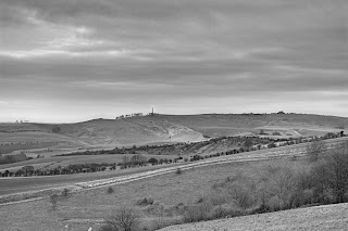
I worked up the image above as both a colour and black and white and discovered something interesting.
When I produce a black and white I always start from a finished or near-complete colour image. I find this gives me the best overall results. On this occasion I did the same: completed my colour work in Lightzone then completed the black and white. I then went back to convert to final TIFF output, starting with the black and white, then disabling the stack to convert the colour image.
The thing I found was that some of the local optimizations that I made in black and white also improved the colour, even though I hadn't thought to make the changes when working in colour. I think that maybe this has to do with working purely on tonal balance with the B&W, which is something that can get overlooked with colour. I think I might try this in future with colour images: apply a black and white conversion then check if there are local tonal adjustments required.
Here is the black and white version. I actually intend to hang a large print of this at home but I'm still undecided whether it is colour or black and white that belongs in the series.


Thanks for that. I'm also liking the black and white versions of the other shots in this series, too.
ReplyDeleteI also noticed that rock when I took another look at the colour version last night. I'll have to take a closer look & see what to do with it - might just clone it (and the neighbour) out.
I won't vote for B&W or color, but I like the little idea you have about doing image adjustment in B&W that applies to the color version.
ReplyDeleteIt's a great idea, and even if it is very obvious once it is on the table, I hadn't thought of it before. It makes perfect sense that it can be easier to adjust tonality when you remove the color distractions.