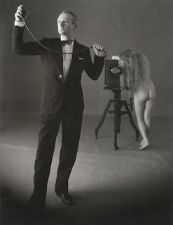
 Cecil Beaton with Nude, New York, 1946
The Irving Penn Foundation © The Irving Penn Foundation
(from the National Portrait Gallery website)
A couple of weeks ago I spent a day in London and took the time to visit the Irving Penn exhibition at the National Portrait Gallery. It's a fairly wide-ranging collection of work, covering the entire span of Penn's career and displays a variety of print types from early vintage silver prints, through his later reprints and includes a number of his Pt/Pd prints as well.
The space is divided chronologically from the earliest works as you enter, working through a series of sections dedicated to periods largely grouped by photogrpahic style as Penn moved from full-length portraits to more and more intimate and close-up work as time progressed. Overall it's a pretty impressive collection of work.
One thing I think could have been included is a small section showing the development of Penn's printing technique. Something was made of this in the exhibition, as Penn turned to platinum printing to try and create his idea of the perfect print. Showing a small selection side-by-side highlighting this development would have been good. As it was, I had to move back and forth between the prints to study the differences and development.
It is clear that his prints became better over time, both as materials and technique developed. The early prints (such as the one of Cecil Beaton pictured her) are quite flat in coparison to later prints. Reprints are also better than the vintages. Much has been made of the higher value of his Platinum prints, both due to the method and the fact that they demonstrate a great depth and subtlety of tone. One thing that is clear, howeer, is that thePlatinum prints influenced the later silver prints, as those show tonal work dveloping over time to mirror the platinum prints. Personally, I prefer the later silver prints.
One large problem I have with the exhibition is the lighting. I can accept that they wish to kep the lighting subdued to preserve the prints (and there was a note posted to that effect) but more could have been done. Not only was the lightling low (read; dim) but it varied in intensity and coour throughout the exhibition and was far too warm 9read: yellow0 for my tastes. so much so, that it was near impossible to spot the difference in toning between the platinum and silver prints. with modern lighting technology, I expect more from a world-class gallery, especially when they're charging decent money to get into the exhibition.
And then there is the subject matter itself. A wide range of the great and good from the Forties to very recent (Penn was photographing almost up to his death in 2009). almost all are presented in distinctive style even though the posing of the subjects changed over time. The early works feel a little distant, maybe even impassionate, largly due to the stood-back, full length nature of the work. through the middle section, from maybe the late 1950s through to the early 1980s, the connection with subject grows. The portraits are deeper and deeper studies of character. What was then surprising was that the very latest works, maybe the last 15-20 years of work, appeared to be very flattering of the subjects. Well know faces, whose images have been seen thousands of times in recent years, all appear very much younger than their ages at sitting might suggest. Does this represent a softening of Penn's attitude to his subjects in his later years?
Saying that the work represents a distinctive style, three woks stood out as different. the first was the portrait of Beaton shown above, which is a pose and style more becoming the subject and quite unlike Penn's other work work of the time. the second was a portrait of Grace Kelly from 1954, shown in the classic Hollywood style that seems to be a feature of portraits of her at that time. The third is of Richard Avedon from 1993, which looks mre like an Avedon print (although against a dar background) than one of Penn's others.
A slight aside: there is a book that has been published to accompany the exhibition. You might have seen a review of tha here, too, if I'd been inclined to buy it. At £25 it's pretty reasonable but Istill didn't think it was quite worth it. the main reason being the print quality. Despite being tri-tone and capturing a good sense of the tonal range of the originals, they were all printed far too light for my taste - deep blacks becoming a little too grey and the darker tones a bit washy. Not the best reflection of the originals nor a great example of book-printing, IMO.
Overall, a high-quality, interesting exhibition (despite the crumby lighting) that is well worth a visit.


