Thursday 28 February 2008

Own worst critic

Gordium, Stourhead, April 2007

I read a lot of photographers expressing the opinion that they need time of detachment to be able to properly edit their work. It is as if it is a vital part of the photographic process to provide detachment to be objective, with the implication (or explication) that immediacy creates a positive emotional attachment to the work.

I must be odd, for I find the exact opposite. When I am first looking through the photos from a day's shooting or a whole trip, I often find very little that I feel truly reflects good stuff and bears any relation to my experience of the time. The time of detachment actually creates a more favourable impression, I see more merit in the rejects and I often go back and rework things from an earlier time. The image with this blog is a case in point. At the time I only worked up about 3 shots from the hundred or so from that day but now I'm finding a few decent ones amongst them.

My initial feelings about places or events are very particular and at the time I never feel like I am capturing that essence in my photographs properly - hence the very limited selections. By letting those feelings subside to memories I can get more from recreating the sense of the time and place through selecting and working with more of the shots. The fear is that this revisiting does 2 things, it recreates a false sense of the time and it may introduce mediocrity into my photographs. It is almost as if my emotional clock is running in reverse to everyone else in that respect.

Tuesday 26 February 2008

Variations, choice and personality

Woodland lane, Stourhead, April 2007

The Pauls, Butzi & Lester, had posts about working a scene and gaining different perspectives of a given scene. I thought they had pretty much covered the subject until I read the recent posts from Doug Stockdale on autobiographical work. This sparked off a series of interlinking thoughts.

On reflection on the first point, I think my working of a scene tends more towards Paul Lester's approach, although I probably press the shutter release less often than he does, instead inspecting things for the angle I like before shooting.

On reflection on the second point, I wondered if the way we put ourselves into our photography takes the form of autobiography in the sense of showing our life story or whether it comes through as our personality reflected in personal style.

Are there in fact elements of these two issues coming together? The way we approach a scene, the shots we take and ultimately the images we select then forming a part of us. Are these selections reflections of our personal history? Of course, everything we do, think, choose comes in some part from our accumulated experiences but is the choice then a reflection of those experiences or a result of them? Does the development of personal style come as a consequence of the way in which our personality develops through our experiences? Are there actually elements of both these things?

There is an empirical method we could apply, something I find interesting in itself. Take a group of people and show them a collection of our work. Which images do they choose and why? Are they the ones we would choose as our personal favourites? Would they choose the ones we really don't like? My (limited) experience in this area suggests that there is a lot of personal emotion wrapped up in such a choice - there is no absolute measure of best (as in favourite). Each viewer takes something different and personal from their observations.

I'm no philosopher and have no background in social sciences so don't really have answers.

On first reflection I think it is neither black nor white. We are a mixture of our experiences which then we bring to bear on the work we do. This, in turn reflects, in some part, those experiences which lead to new encounters. In some sense we are, through our photography, both telling some part of our life story and reflecting our current state of mind.

Sunday 24 February 2008

Artistic choice: paper and profile

As much a part of the photographic process is the choice of paper and the profile to go with it. Many photographers talk about the papers they use, the surface, the gloss etc. It is important, however, to make these choices based on artistic goals rather than technical ones.

What brought on the thinking about papers? I tried a new type today. I'd been having trouble getting hold of my regular paper so tried something that is fairly similar. the new paper is Ilford Gallerie Classic Pearl, but that is not important. What is important is what effect it has on my prints. It is slightly (very slightly) warmer than my previous paper and has a finer surface finish. Ilford also supply a vast number of profiles and happen to support my printer, too. Nice.

Result of the first prints are very good. It yields a more subtle translation of fine detail, which is something I am constantly striving for. The colours are balance - not too saturated and even across the spectrum. More detail is carried in the dark shades with a finer tonal transition, which is something I'm looking for at the moment in black and white. Plus black and white is actually more neutral, balanced nicely by the slighter warmer paper tone. Overall it is very much meeting my needs at present with this printer which is great.

The point is, this paper much better suits the aims I have for my prints. even with only 2 or 3 off the press, I find the results much more in line with my aspirations. That is what counts.

Of course, I'm hankering after a decent, larger, pigment printer but that will have to come later.

Saturday 23 February 2008

A splash of colour

Avoncliff weir, Wiltshire, January 2007

I've been posting a lot of black and white pictures recently, so here's somthing in colour. I've been revisiting some of my older shots from around Wiltshire to see if they fit in with my on-going project. The entire project will eventually be presented in black and white but this is one winter shot that looks particularly good in colour, I think.

Lightzone: getting the most out of regions

Silbury Hill and Avebury, Wiltshire, January 2007

This is another in my series of tips on using Lightzone. Regions are applied somewhat differently in Lightzone than other applications. Personally I find them easier to work with than masking in Photoshop (for example) and the ability to change at will at any time is a big advantage.

Here are a few things I've picked up along the way about using regions effectively. For all of the illustrations here I've split the area in the region to be a before/after shot - the editing tools don't provide the clean slice through the middle.

ND graduated effects

Placing zones outside the image area

As I shoot quite a lot of landscapes with horizons, a ND filter is an invaluable tool. Unfortunately, I've not always got one handy. There are also times where a straight edge filter isn't going to help. A polygon region can be used for this, together with a large feather area to soften the transition. To get a similar effect to a ND filter, we want the feather to apply edge to edge. This is where placement of the region outside of the image area is needed. To do this, zoom to smaller than the edit window size (typically 1:4 or smaller). As the feather is rather loose, we don't need to be too worried about precise zone placement.

Running regions outside of the image area is an important feature as it is the way to apply selective feathering.

Feathering and edge placement

Polygon region with small feather

When working on isolating a specific feature or object, we want an adjustment that provides a natural look without harsh transitions. I find that applying the feather to overlap the edge of the isolated feature helps with this. In the case above, I've only needed a small feather region as the effect on the surrounding part is rather limited.

Below I've done something similar but with a much large feather area for a smoother blend.

Region types

Bezier region with large feather

Although there are 3 region types (polygon, spline & Bezier) I almost never use the spline. I find the other 2 give me all the control I need. Polygon for straight edged features, Bezier for the rest. If picking out an edge with a Bezier region, it is best to place a point at every high & low spot along the curve to get a smooth match. Sharp corners can be produced with 2 points close to one another.

Editing large areas

If you are editing a very large area then a handy trick is to pick out a small portion for testing the changes. this minimises the amount of re-drawing the Lightzone does. Once happy, disable the tool (deselect the "tick" mark), place the area more accurately then re-enable the tool.

This is particularly useful when working with large files such as stitched panoramas or MF & LF scans.

Inverse versus normal

Sometimes we want to apply changes to a large area excluding a small portion. In this case it is best to place a region around the small area and use the inverse button on the tool it applies to.

If you wish to apply one set of corrections to one area and others to the rest, select the initial region and then copy it. There are 2 ways to copy: linked (--C on Windows) and unlinked (-C). Linked means that region changes in any of the linked tools apply to all the other tools in the link. Unfortunately, Lightzone doesn't let you know which are linked. I suggest using some sort of naming convention for the tool names to indicate the linked tools.

Black and white conversions

One of the great things about being able to apply regions to pretty much all the tools is that you can apply selective black and white filters. When a region is used for black and white conversion, that area is fixed and further B&W tools don't affect the region. Thus, if you wish to apply a yellow filter to the sky and red elsewhere: mark the region around the sky & apply the yellow filter, then apply a red filter with no region. The second filter ensures all parts of the image convert to monochrome without affecting the previous filter.

Friday 22 February 2008

Nothing so modern as the ancient

Hedge & barn, Wiltshire, January 2007

Mark Hobson has been citing lines from P H Emerson's "Naturalistic Photography" (found via T.O.P.). Here's some more:
But the artist sees deeper, penetrates more into the beauty and mystery of nature than the commonplace man.

no one can criticize any branch of art and the criticism be authoritative, unless he be a practical master artist in the branch of art which he is criticizing

The great heresy of 'sharpness' has lived so long in photographic circles ... for all through the lens has been considered purely from the physical point of view, the far more important physiological and psychological standpoints being entirely ignored

Remember, this was published in 1889.

I could blog for a month on this book and not run out of material. Go find a copy; read, re-read.

Thursday 21 February 2008

A world full of ordinary beauty

There is a piece running at the Daily Telegraph on this year's Deutsche Börse Photography Prize exhibition, running at the Photographers' Gallery, London. it's quite a collection of work and worth a look. It seems a little odd that much of the work was produced quite some time ago, not quite what one would expect from a contemporary art award.
Personally, I'm particularly struck by the work of John Davies, largely because he depicts a world that is instantly familiar to me. He shows views that are simultaneously ordinary, un-scenic (in a traditional sense) and yet very aesthetic as photographic work.

Wednesday 20 February 2008

The art of darkness

BC Waterfall, from the Foundations Folio
© Doug Stockdale, used with permission

Last week I received my copy of Doug Stockdale's Foudations Folio - a collection of 12 prints from his earlier pre-digital landscape work. Looking at the prints and the overall folio, a couple of interesting things struck me.

Before that, why did I buy the folio? 2 reasons - I like Doug's work and this was a great way to get some prints in my hands and I wanted to get hold of some high-quality prints as a sort of benchmark to work towards in my own work.

The first of the things that struck me about this work is the incredible way the tonal range has been "stretched" while retaining subtle detail in both the highlights and shadows. It's clear that a lot of effort has gone into producing these prints and ensuing careful control of the details. I'm also impressed with the way darkness is used to great effect (hence the post title). While it is not always the appropriate thing to do, where Doug uses the effect it is highly appropriate.
Often I find prints on fine art paper like this appear lifeless but these prints have great life and 3 dimensional quality as well as being very tactile objects.

The other thing that struck me is what a great format a well constructed folio is for presenting photographic work. I have the combined advantages of quantity of prints that comes with a book together with the quality that comes with individual prints and at a reasonable price. Doug ha also put together a great package including index prints, notes, colophon etc which brings the whole together. While these are diverse subjects the supporting material and the consistent style add up to a unified product that is very nicely presented.
I think this is a format of presentation that more artists should consider: a great way to get quality product into the hands of reasonable numbers of people.

Another handy hint for making books

Kjell Harald of the lentic blog has another handy hint for helping put together your photobook. His idea of using low res for the mock-up process will be integrated with the process I highlighted before. Like him, once the content is sorted, I reckon the book can be mocked up in about an hour or so. That leaves plenty of time to work on the details of the design.

Monday 18 February 2008

The book-making process - some things I've learnt

Having spent quite a lot of the weekend putting together a book from my 36 bicycles pictures I've learnt quite a few practical things that may be of use to others (especially the SoFoBoMoers). This is all to do with the mechanics of the process rather than the design aspects:

First, my mental arithmetic is as bad as ever. I'm working an 11"x8.5" landscape format with 1" border and 0.5" gutter. Image width is thus 11-2.5 = 8.5". I resized all the pictures to 9.5" wide. Next time I'll take more care and write it down.

On that border size, for this format that is probably the smallest border (i.e. largest picture) that I could go with. Each image actually ends up looking quite large on the page.

The paper mock-up I mentioned in my last post was invaluable, especially when I missed a shot from the sequence in the software. Having my desired sequence handy was useful. Next time I will also try and print the filenames for indexing.

Indexing the computer files into a dedicated folder makes life simpler. I had the order I wanted on paper but had to search around through the files to find the right one as I added them to the book design. This took far too much time and could have been quicker. I will probably run 3 versions of each for the book, with separate folders. 1 version for the online/dedicated software (such as Blurb & Bobbooks use), 1 for a low-res online pdf version (with sRGB colour space) and 1 for the high-res print pdf (with AdobeRGB). That gives me distribution possibilities and is minimal effort to generate.

As for pdf generation, I'm finding it useful to run up copies at key stages: initial layout, image sequence, final completion. This helps me with the editing and quality checking as I go along and reduces mistakes in the final output.

Composing text in a separate file then adding to the software will make it easier. Word processors are far faster at raw text generation, spell-checking and the like. That will also give me independent versions of all the book components. I find Scribus a bit clunky for this bit and it then had me confusing layout and content generation. For me, the best workflow is to create all the content then put it together & lay it all out. Content and design are 2 separate issues.

As to Scribus, I may have to write a separate post but I like it quite lot. I find it quite intuitive to work with, it doesn't get in the way of simple tasks and the interface is quite simple. All of that hides a huge amount of power but for a photobook I don't need all the power, just the ability to get at key features quickly. I find it's enabling me to do that. All that from free software. Microsoft could learn a lot about interface from these guys - I'm not constantly being hassled by the software to do things the way it thinks best, it just does what I want with minimal fuss.

Saturday 16 February 2008

SofoBoMo: the book mock-up process

The mocking-up process, February 2008

With recovery from a sprained ankle keeping me off the bike I decided to look at the photobook process. Seems like everyone is getting into the act, so I'd better.

I realised that my earlier 36 bicycles project would make an excellent basis for a trial run. After first running through a resize exercise i then printed them all off, 4 to a page, on plain paper. What you see here is the result of me "storyboarding" them on the dining table into some semblance of order. I made sure I pencilled in the number order, too, just in case I blew them everywhere. next will be pulling it all together as a pdf.

The book will be 35 bicycles as one didn't fit at all. that is something to be wary of for SoFoBoMo - making sure I have plenty enough images to collate 35 as a group.

Two mentions to finish - thanks to Colin Jago for elevating my stock on the SoFoBoMo exchange, I'm not sure i really deserve it. Also to Mark Hobson for his postings on POD photobooks (from here forwards) which takes some of the fear factor out, I think.

Friday 15 February 2008

Lightzone 3.4: a first pass review

Lightzone has recently been updated to version 3.4. Now that I've finally installed it, here is my first pass look.

First thing to say is it doesn't look much different from version 3.2. The major change in interface is in the use and application of Styles. I rarely use Styles so haven't bothered too much with that but the new preview feature is quite nice if you expand the preview pane.

Speed seems quite a bit improved - i ran some editing on a large format scan (190MB 16-bit TIFF) and it clipped along quite nicely, until I came to do a 100% view for sharpening. Lightzone also seems to handle memory a bit better but still loads up the memory when scanning folders.

Other than that, i don't really see any changes. Is it worth the upgrade? If you're a 3.2 user I'd say so. I'll still be using 2.4 as my primary version.

Further sharpening techniques

Following my posts on reducing the need for sharpening and sharpening techniques in general, then read George Barr's post on a similar topic. An intersting point was made in the comments about applying 2 Sharpening layers to separately control the lightening and darkening effects of sharpening. What a great idea, why didn't I think of that before?

So I had a go and the results look promising in Lightzone. One problem I generally have with Lightzone sharpening is that is creates a lot of bright artefacts. This new technique can help cure that (especially when coupled with my previous techniques).

In Lightzone this is relatively easy to do: 2 Sharpening tools, one with blend mode set to Lighten, the other set to Darken. A bit of experimenting is needs but I'm finding that the darken tool can be applied a bit more aggressively and the Lighten needs less plus a reduction in the opacity.

Here is the same example as I used before (click for 100% views):

No sharpening applied

Standard sharpening

New lighten-darken technique

These are 100% plots, therefore a lot larger than an actual print. The unsharpened produces a decent print, not unlike film. The 2 sharpening techniques produce very different results. Even though I've backed off the settings (Lightzone settings generally need to be higher than Photoshop USM) in the regular Sharpen version it is still producing a much more aggressive result especially the stippling in the fields. The new method uses fairly high numbers and zero threshold yet produces a more "natural" look to the sharpening.

I've also tried this method on a few other prints and the results are very good. The effects can be fine tuned quite a lot by having a layer for both the lightening and the darkening. It's proving useful for images with lots of fine detail. I won't say it is a panacea but it is another very useful technique to have in the tool kit.

Thursday 14 February 2008

A couple more from Stavanger

Iron and wood, Stavanger, February 2008

Twisted trees, Stavanger, February 2008

I'm not sure if I like this second one or not, even after considering it at length. I think maybe it's because I didn't quite pull it off technically but yet I keep coming back to it.

Dockside

Dockside, Stavanger, February 2008

I really like the prints that the softer treatment of my film images produces. this is another one.

Wednesday 13 February 2008

Digital crisp, film smoothie

Breiavatnet, Stavanger, February 2008 - "film" treatment with little contrast adjustment and sharpening

Same image treated as per a digital file: severeal layers of contrast adjustment and sharpening

Working through the film scans, I realised that I was probably over-working things. I've got so used to a workflow for digital, that I was applying the same techniques to the film scans so I decided to run a couple of prints. Although it doesn't show up really well in these small web versions, there is a lovely subtle look to the "film" version as oppose to the "digital" - it is a much better print. I think in part it is due to the inherent lower resolution & grain of the ISO400 film. Partly I think it is just that film renders the scene differently.

Field of vision

Front door, boots, The Hague, December 2007

The above shot is another from the recent roll of HP5+, this was the first shot with my new 28mm lens.

It's interesting to me for a couple of reasons. First, I was trying some things looking at depth of field although they didn't really work due to the low light (hence slow shutter & slight motion blur).

The second interesting point is to do with my own personal field of view and how it relates to focal length. I've observed through trial that close-up (couple of yards) I see things at around 28mm (35mm equivalent), medium distance (say up to 30-40 yards) I see at around 35mm and for longer distances I tend to see a bit narrower (50-70mm). Only when presented with a wide scenic might I deviate, then I tend to hop between 35mm and 100mm being the difference between "taking in the view" and "looking at a feature".

This is also somewhat borne out by the range of focal lengths I use in my photography (although I've not done any detail analysis short of flipping through EXIF data on several shots).

I think this is why I like my 17-55mm lens for general purpose: it covers me for my natural view of the world over a wide range of subjects.

Tuesday 12 February 2008

Finally some photography

Cathedral Square, Salzburg, November 2007

After a while without any photographs, I've just scanned a roll of HP5+ I've had around for a while. This was the first roll with the new walk-around set-up (although this shot was with the 50mm). A few more from this roll over the coming days.

Sunday 10 February 2008

A view of something different

For a while now I've been following the Asian Photography Blog, after my musings on the influence of culture on photography. It is largely a showcase for Asian photographers, acting as a stepping-off point to go search their work.

Things have been a bit slow there recently due to Chinese New Year but it is an excellent place to pick up on photography from the other side of the world and, for me at least, provides an interesting counter-point to the normal diet of American and Western European photography.

Well worth a look, regardless of the type of photography that interests you.

Saturday 9 February 2008

Digital files without so much sharpening

I mentioned before that I have been developing a workflow that, in some instances, does not require output sharpening. I thought it might be of interest to go through the process to show what I've put together. This is particularly useful for all you ETTRers (Expose to the right), where the initial file can look very flat on-screen.

I realise there are specialist tools out there for sharpening. PixelGenius' PhotoKit Sharpener comes in for a lot of praise. Trouble with that plug-in is it is expensive and requires a full copy of Photoshop, also expensive (and which I'll not be buying any time soon).

Most of this work has been done in Lightzone, if you use curves in Photoshop or similar, read my primer on the ZoneMapper. ZoneMapper forms the core of this process, providing small but significant local contrast adjustments.

I'll step through a black and white image, as this happens to be the most readily to hand. I'll explain the differences for colour at the relevant points.

Initial conversion

This is straightforward: basic RAW conversion with your favourite settings. I tend to apply an exposure compensation such that the histogram just grazes the right edge. That may be either positive or negative adjustment (latter for highlight recovery). I'll also apply local white balance adjustments if there are several areas with different lighting.

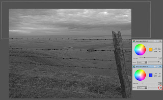
Initial conversion using on the RAW tool

Basic tonal range adjustment

First up I do an overall adjustment. Scenes compressed to the right usually have the dark areas pulled to the shadows. If there are dark shadows I use Lightzone's ToneMapper or Relight tools to compress the overall range (more on these techniques in another post).

Overall mid-tone & bright contrast

Once the image has the basics of tonal range and colour, I start working on more targeted contrast. first I expand the mid-tones and having a lot of sky in my shots (typical of grand scenic landscapes) I also look to expand the contrast in the brighter portions.

Micro-contrast sharpening

I use the Sharpen tool, but not in a way that I think of as sharpening. This is the "hiraloam" (High radium, Low Amount) technique. At this stage a first pass with settings (amount, radius, threshold) of about: 20-40, 20-25, 0. Later on I apply a second pass of 10-15, 50-75, 0.

After overall tools applied. Note that the sky has had a separate contrast enhancement.

Black and white conversion

Up to this point, I've got a pretty good colour image but even if the final output will be colour I'm now applying a black and white conversion to apply tonal corrections to specific areas. In that case I use a basic B&W tool.
For a black and white output I'll convert different areas with different B&W passes. In Lightzone the black and white tool acts like a photo filter of given colour and intensity. this can be applied to achieve the desired effects. For me, I look to pick a filter that gives me the best tonal contrast for the area applied.

Black and white conversion. The lower B&W tool is used for the lower part of the image - note the inverse button used on the highlighted region (circled in red).

Dealing with contrast in individual areas

This is really the heart of the adjustments that minimises sharpening requirements and gives the greatest impact to images. Each individual area of an image has a specific, but fairly light, contrast enhancement applied. An area is usually defined by clear boundaries or tonal/colour separations.

The technique I apply is this: add a ZoneMapper, define the region. Add a zone lock to the boundary 1 step above the lightest indicated in the ZoneFinder and another lock 1 step below the darkest. These 2 zone lock are then stretched to increase contrast in the given area. Usually the top goes to about the 3rd zone from lightest and the bottom to about the 5th or 6th zone from darkest. I'm looking for an effect that is noticeable but not overly so. If there are strange tonal effects & posterization, back-off. It probably takes longer to read the description than do.

I find that these adjustments help with both macro and micro contrast in the way Lightzone works. Fine detail is really brought forward.

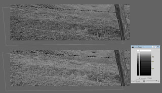
Example of local enhancement. Top is before and below the after, with the ZoneMapper used.
Once this is done, it's the point at which I apply the second hiraloam sharpening pass.

Reverting to colour

If the final output will be colour I disable the black and white tool and just check the opacities of the previous ZoneMapper adjustments to make sure they aren't too much, adjusting the opacity as required.

Final adjustment for output

First step is to convert the Lightzone file to a 16-bit TIFF, uncompressed. I can then work this into various output formats.

Output format is the one point where I do use Photoshop because Lightzone isn't really up to the job. For the web, I resize (normally with Genuine Fractals), switch to sRGB and maybe apply some sharpening (most of my recent output hasn't had any).
For printing I resize and then do a black point & mid-point adjustment using curves. This is to ensure I capture the range & brightness my printer gives. Black & white points are checked with a Threshold layer.

I would then apply any sharpening if required for the print. USM levels have come way down. In the past I may have applied as much as 150-250, 0.6-1.0, 5-10. Now its only a tweak, 75,0.5,5 might be typical. Images with a lot of fine detail or large expanse of solid colours will get sharpened with Picture Window Pro before opening in Photoshop.

When I printed this particular image, the unsharpened print looks like it came from film - very slight softness in some of the fine detail, especially around the top of the fence post. USM 75,0.6,5 was all that was required to sharpen all the detail right up.

Final result

And this is the outcome, adjusted for the web. Prints are now sharp but more subtle in the details and jump off the page.

Fence and farmland, Wiltshire, December 2007

Friday 8 February 2008

Sort of SoFoBoMo: a photo POD resource

Mark Hobson at the Landscapist is proposing to put together a sort of POD resource cum marketplace for self-publishing photobookers. Seems like a great thing for SoFoBoMoers. Go check it out and if you're interested, let Mark know.

Tuesday 5 February 2008

A source of inspiration

In response to this post, Ade provided a link to Andrew Sanderson's website. There is much to see there and some very fine work.

In the context of the comment, though, I suggest anyone who is short on photographic inspiration check out his At Home series. Some beautiful work without leaving the house.

Of course, I could never produce such work from my place as it is has a decorative effect that can only be described as "aftermath".

UPDATE: correct the typo in Andrew Sanderson

Monday 4 February 2008

SofoBoMo: I finally think I'm organised

After Paul Butzi's recent post I realised I was nowhere near organised enough. I spent the weekend correcting that.

There is one constraint on me at present (which I'm hoping to turn to an advantage) - I'm already scheduled to be away for 2 weeks of the flexible month.

Where am I now: I have my project, slightly scaled back in scope from before. I have a page layout sorted that I've trialled on similar shots to those I'll be producing for the Big Month. I also know what page size I'm going for (8.5"x11", landscape - a size that makes it easy to tweak to a variety of landscape sizes).

The only thing I'm not sure on is whether to have a fully ready-to-go book (a la Mr Butzi) or treat the exercise as something of manuscripting process (much as NaNoWriMo, which is what Colin Jago is doing).

This all comes down, I suppose, to whether one has a POD publisher in mind or not. I can't seem to find one that will do the medium size landscape format I want which doesn't help.

On the POD front, I came across this excellent article on the whole POD issue, with some excellent links at the bottom to go looking for POD offerings, including those to avoid.

Saturday 2 February 2008

Digicam prints

This morning I decided to try some prints from my digicam. I printed off the photo from the last post ("Preparing for the off") trying a couple of processing options. These are actually the first prints I've produced from this camera.

This was shot at ISo400 which appears pretty grainy on screen but is sharp as I had balanced the camera on a solid object. (An aside, the Samsung A503 that I use has a flat base and flat ends which makes it ideal for fixed position shots. All the hotel room shots were done this way. It's a feature I'd look for in a pocket camera in future.)

In all cases I cropped the dark portion along the bottom and a funny dark stripe that appears along the top edge. I also rotated slightly to overcome the small tilt.

First up I went my normal route: shadow noise reduction, tonal separation and as much contrast and output sharpening as it would stand. Loss of detail from noise reduction (even restricted to the shadows) and aiming for a smooth look really limited the amount of brightness I could get.

The second try was to ignore noise reduction, take the grain as it comes and try brightening the key areas. A final tweak kept the tones even in the sky and dark parts of the water.

The final outputs are surprising. Both prints are 8" wide on 12" (A4) paper - that's native resolution at 300ppi. The "smooth finish" from the first effort has great tonal separation in the shadows and has quite a lot of fine highlight detail but the main parts of the image are way too dark. It has nice details and stands up well to normal viewing distances but lacks a little something overall. The second print is much better than I had expected. the noise produces a very fine texture in the shadows that is not at all unpleasant. Lack of NR means there are a few details that haven't been lost and the ability to brighten the mid-tones more (by being less worried about noise) gives a real lift to the print. I'm very pleased with the outcome.

I had started this little exercise wondering if I could really produce good prints from the A503, with it's grainy output and limited resolution (5MP). It turns out that the printed image is even better than the on-screen with plenty enough detail for a goo, medium size print. Wven with the fairly well compressed JPEGs, there is plenty of scope for enhancement to produce quite a fine print.

I'll have to experiment with colour now, to see if there is a similar story.

Friday 1 February 2008

Isolation or loneliness?

Preparing for the off, Stavanger, January 2008


Ah, serendipity or coincindence?...

Today the Landscapist says:

Most photographers are 'hobbyists'. On the whole, they are not trying to
"say something about something worth saying", they are just trying to make
pretty pictures. For them, the act of making pictures is little more than a
pleasant activity with which to occupy one's time.

and also Paul Butzi quotes playwright Robert Schenkkan

The process by which stories emerge is kind of mysterious. I’m not trying
to be coy, but I also have not, to be honest, tried to examine that process too
closely for fear that it might damage it.
whilst at the same time I had been thinking about the context of my last couple of posts.

On Tuesday I posted a photo which I titled "Spartan: the loneliness of the business traveller" and then yesterday I posted several that I took in my hotel room. At first yesterday's shooting started as "goofing around" but it started to form into a mini-series, which I posted. I wasn't really thinking too hard about the composition (so it was interesting to read Tommy Williams' comments). The photos just sort of came out. What formed, though, was a sense of the spartan, isolated surroundings that make up the typical business hotel room. I started thinking about the idea of isolation, being alone and whether or not it constituted loneliness as in my first title. I don't think so.

Travelling on business like this certaainly has me spending a lot of time alone but that happens anyway at home. In the hotel, however, there is a distinct feeling of isolation - being placed apart from real life. This doen't necessarily mean loneliness. Lonely is a loaded word, to me it conjours up feelings of both isolation (being alone) and exclusion (not connecting with other people). In fact the only times I really feel "lonely" in that sense are in crowds. When I'm by myself I'm quite happy in splendid isolation. OK, I've got the Internet at the moment but if there was something good on TV, I'd not be sat here writing.

What's all thisgot to do with the 2 quotes above: well, I realised as I was snapping away in my room that there was more to shoot than just pretty pictures or picturing as a distraction but I wasn't really thinking too hard about the process (I'm not sure I ever do at the time) but just letting the pictures come out. It was only after that I brought the whole thing together into this train of thought.