(precisely this note) Colin Jago has written a series of how to do a B&W scan negative as positive then use ColorNeg for the inversion. It's doing a similar thing to my experiment with PS Levels, but automatically. Now that I've seen the benefits of going that way, I'm going to take a look a ColorNeg, for sure.
Tuesday, 30 October 2007
Monday, 29 October 2007
Optimising black and white scans
After I posted some of the results from my first foray into B&W film, I decided today to look at options for scanning.
My initial scans had used the negative scanning options of my Epson V750, with the default film curve for Ilford HP5 plus 400 and a gamma of 1.8.
So I tried some things: gamma range 1.0 to 1.8, tweaked film curve, negative-as positive (followed by several inversion options in Photoshop).
Here's what I learned:
- gamma needs to be high to get a good negative scan. The curve applied for HP5 actual has a quite negative (<1)>
- Tweaking the applied curve in the scanner (or at least the output range) helped a lot. The default is for the scanner to take the range of tonality found and stretch right out. This buries the shadows and washes out the highlights leaving little room for further processing.
- Scanning as a positive means a low gamma. 1.0 seems just right to get the full range of info for further processing. I output to 2%/98% range to avoid clipping.
- Inversion options are varied in PS (I use elements, so there are fewer options). The Invert function is like dragging the thing through mud: it's hopeless. I tried adjusting the curve then inverting: no better.
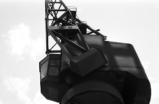
Here's a comparison with one of the shots I showed before. Lower image is with the new negative as positive workflow. Not quite optimised but much, much better.

Posted by
doonster
at
02:48
1 comments
![]()
Saturday, 27 October 2007
Where it all started
So, the first step in my journey to define my aims is to think back to why I started with a camera in the first place. As luck would have it, I was rooting through a box of old stuff and found all the photos I took as a kid. This is the first ever photograph I took:
So what brought me to want to take photographs? I think the initial motivator was something along the lines of wanting to create my own postcards: memories of the places I visited & the things I thought were interesting. It's hard to tell: it was a long time ago and I don't really remember. I definitely got into it right away, I used to carry a notebook and write the dates and locations of each shot, which is why I know exactly when this photo was taken.
I didn't take a huge number of photos - for me developing & film were expensive, each roll represented several weeks' pocket money and so I was careful what I shot. Single frames per subject only.
It has also been interesting looking at the subjects and compositions. There are a lot of similarities to the things I shoot today and the way in which I shoot them. Either that means I showed talent from an early age, or it shows I've not made any progress at all. Technical quality back then was poor. The first few rolls were on Dad's old camera until I was given my own: a Konica Pop - fixed 1/90s shutter but actually had variable aperture (in the guise of an ISO selector on the front).
All that early stuff is really a documentary on the events of my life and the places I went on holiday. There was no photography for the sake of creating pictures, they are all of something or somewhere. In that regard, I have definitely changes quite a bit - I now take photos to create images of things other than the places I go or thing I do (although I still do that as well).
I might scan and post a few more of the early works.
Posted by
doonster
at
04:45
0
comments
![]()
Labels: Direction
Thursday, 25 October 2007
Provoking contemplation
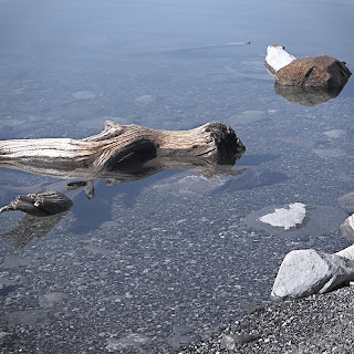 Driftwood and rocks, Alberta, September 2007
I've posted this image before but for me it's a rare example of me hitting my target:
one of my all-time favourites
3 posts I've read today have come together nicely for me. First was the post at the Landscapist that I mentioned in my last entry. Next up, the link at T.O.P. to this article by Thom on setting goals. Third is this post by Colin Jago on analysing why and self-analysis.
While they may not seem related, for me they bring together the themes of what I'm doing, why I'm doing it, and when I know I'm getting it right. I can't say I have it all figured out but I think over the next week or two I'm going to put some effort into putting this down in words.
I can't say I'll be coherent in my thinking, or come up with specific goals but I expect the thought journey will be useful for me. I'll post as I go along; who knows, maybe it'll lead somewhere.
UPDATE: I've added a new category "Direction" to gather all my posts in the "journey" into one place.
Posted by
doonster
at
06:04
0
comments
![]()
Labels: Direction, Thoughts on art
What it is all about
Today's post at the Landscapist has a quote from Robert Adam's that nails everything that I'm trying to do with my landscape photography:
"Basically, I think (we judge art) by whether it reveals to us important Form that we ourselves have experienced but to which we have not paid adequate attention. Successful art rediscovers Beauty for us."
That's it: the connection of overlooked form with beauty.
Posted by
doonster
at
03:15
0
comments
![]()
Labels: Thoughts on art
Panoramic techniques
Lloyd Chambers has posted on his disappointment with some recent pano work. He even goes as far to say that he should be following his own advice (always a good thing to do). It brought up an issue that I've been to and fro with for a while: panoramic devices.
As I shoot a lot of panoramas, I thought I'd share my techniques and thoughts on the matter (with a few examples).
Background
Typically I shoot 5-6 frame, single row images. The widest I've shot is a 27 image loadsa-megapixels image that hangs over my computer (reduced in size to 6 feet wide). I shoot both handheld and from a tripod and have recently been doing HDR panos using bracketing techniques.
The issues, a summary
There are a few key, and related, issues around shooting panoramas. The number 1 is avoiding parallax errors. The technically correct way to do his is using a nodal device to rotate around the lens's nodal point (for an explanation of nodal points go Google it). The next key thing is about covering enough angle of view - when you stitch images there are losses around the edges for the image distortion. Then there is colour & exposure variation between frames which needs to be kept constant (or close to).
For most of my work, I break all of the accepted wisdom and still get great results. I'll explain how and why. First off, parallax is only really a major concern if there are objects close to the camera giving a large angle of view offset between near and far and there is a large angle of view change between successive frames. If you're shooting things far away, parallax becomes a minor (correctable) problem and if you do a lot of overlap the shift diminishes (again correctable). Colour & exposure variation can actually be corrected with RAW processing & smoothed in stitching. More on that later.
My shooting techniques
Here, then, are the things I do to get the base images for stitching:
Handheld: conventional theory says you can't do panoramas effectively handheld. No nodal point rotation so variations in vertical and horizontal. If, however, one sticks to the notion of minor angle of view changes between images and keep the distance to subject large enough, this can all be fixed. I might do as much as 75% overlap on handheld images, certainly more than for tripod work. I get very good results even with subjects as close as 10m.
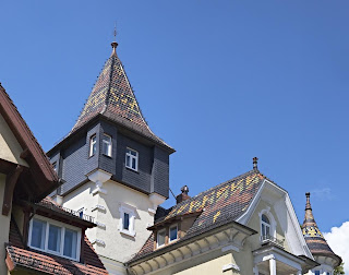 Heidelberg roof, July 2007
4030x3174 pixels, 3 images, single row, handheld:
shot from across the street (maybe 15m away)
has a significant shift applied in the alignment due to the upward angle of view
Tripod: for tripod work I overlap a little less and work with panning horizontally. that doesn't necessarily mean keeping the camera level, which isn't possible for multi-row work anyway. Again, more overlap for closer subjects. I always use a remote release and mirror lock-up. I allow at least 5s after mirror up before firing the shutter to minimise camera vibration. that holds just as well for any tripod work, not just panoramas.
HDR brackets: I've started doing multi-exposure HDR panos. For this I have a programmed release which fires the mirror lock-up then the shutter at 5s intervals for 3 exposures for each camera position. I usually use +/-1 stop brackets with the longest exposure putting the shadows mid-histogram.
Close-up: If there is anything close, lots of overlap. Anything closer than 5m will cause problems, even with great software. I avoid that stuff unless the whole subject is close, then lots of overlap and always with a tripod.
Processing
RAW conversion: the aim of my RAW conversion is to balance colour & exposure and also remove significant distortion (although the latter is really a post-conversion step). My target is a colour values change of less that 10% in the overlap zone in adjacent frames. I typically add a little sharpening to the conversion, too: helps with fine tuning the alignment.
Typically I use CaptureOne for the conversion, especially if there is little distortion or exposure difference between shots. the I will apply equal settings to all the frames. Sometimes i use ACR followed by PTLens in Photoshop to correct distortions. Stitching is easier if basic lens distortion is fixed first, even if your stitcher uses lens distortion data.
If I've done HDR, I'll do the combination and tone mapping (with identical settings for each frame) using Photomatix Pro from the 16-bit TIFFs.
Alignment: my stitching is all done with PTGui from 16-bit TIFFs. I don't think any other program comes close in power to this. I tweak the alignment, stitch type (rectangular, cylindrical etc), angle of view, shift etc. Sometimes I have to run the optimiser carefully going through a sequence of steps to close down max error below 10 pixels. I won't go into all the details as it is a very powerful program. 90% of panoramas need nothing more than the auto settings, however.
Blending: always with the Smartblend plug-in. Nothing else comes close. It fixes colour/lum shifts, parallax & various artifacts between images (it has even removed extraneous people from some). I have not yet, with decent original alignment, seem any sign of the stitch points using Smartblend, and that's at the pixel level.
Output: always to max size, 16-bit TIFF.
Final adjustment: Once it's stitched, its off to the regular processing software for final adjustments (crop, contrast, curves, B&W, sharpening etc etc). I'll also do a resize for the output print size which is usually a shrink.
Overall it takes about 10-20 minutes to get to the stage of producing the output. A few minutes for PTGui to work the output magic, then final adjustments. Not a long process at all.
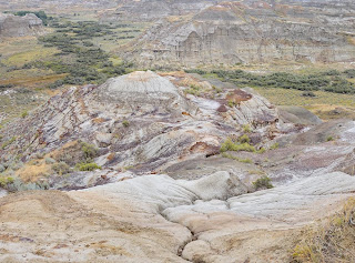 Dinosaur valley, Alberta, August 2007
3887x2882 pixels, 4 frames, 2 rows, HDR: total 12 shots, tripod mounted
looking down so again a significant shift applied in alignment
this produces a very finely detailed 24" print (scaled-up)
Outcomes, conclusions
Pixel level examination: with this total workflow (capture to output) I'm getting prints that can be examined in fine detail, close-up with no signs that a stitch has been done, whether handheld or tripod mounted and without the nodal device.
Simplify the process: overall, Ive worked to streamline this workflow and minimise the kit I need to carry. The output is very good if I take a little care with the initial shooting.
Posted by
doonster
at
02:30
0
comments
![]()
Tuesday, 23 October 2007
Portfolio overhaul
With all the recent discussion on style I realised that my portfolio site was a mish-mash of seemingly random pictures: spot the amateur. Well, I've decided to overhaul the whole structure into more consistent groups and added a bunch of photos into the bargain. Now, hopefully, some of the themes that I follow can clearly be seen in context. Not quite the obsessive pursuit of an idea but much better reflects what I'm trying to get across.
I hope you like the changes.
Posted by
doonster
at
05:41
0
comments
![]()
Monday, 22 October 2007
First roll of black and white
In all the years I've had cameras and taken photos I've not, until recently, actually used B&W film. Mostly, I suppose, because I was part of the happy-snapper crowd.
Well I finally got round to turning the roll I shot this summer into final images. I was using Ilford HP5 plus 400 so that I had plenty of scope for flash-free photography. I loaded it into my old SLR with a 50mm lens.
2 things surprised me about the outcome - first is that I can take decent photos with black and white. I was consciously thinking of shapes and forms. For the people shots, I'd probably have converted colour to B&W anyway. The second surprising thing was the distance to subject that worked best. normally with a 50mm I think middle distances, say 10-100m (first of the examples below). With this film, however, it was the close-up that worked best. Maybe a result of detail overcoming grain, but I can't really be certain. Anyway, here are some of the results:
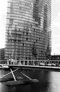
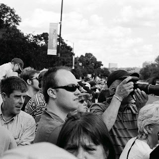
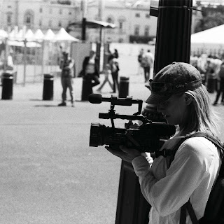
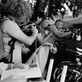
Posted by
doonster
at
01:40
0
comments
![]()
Labels: Equipment, Thoughts on art, Workflow
Sunday, 21 October 2007
Getting through the tedious tasks
Having largely finished all the outstanding image work, I finally got round to all those small things yesterday: backing-up, software updates, archiving etc. I spend far too little time keeping my system organised when I'm busy working on the pictures which is going to get me in trouble one of these days. For example, I had over 500 RAW and 1000 finished pictures to back-up. Took hours for it to get completed.
Maybe I should have less on the go at once, but that would mean taking less photos.
Next up, the scanning: I haven't even got around to scanning the dozen 4x5s and 10 rolls of 120 that I've got ready to go.
So much to do and so little inclination to do it.
Posted by
doonster
at
16:56
0
comments
![]()
Labels: Random
Friday, 19 October 2007
Style, empathy, obsession
There has been discussion of late on several blogs about the nature of style, how style defines great photographers and how style is developed. Probably the best discussions have been over at the Landscapist (start here and work forward to today). Much mention has been made of the obsession of great photographers to constantly go out and create images in a particular style, often of particular subjects.
In a comment to this post, I disagreed with the obsession idea, I think it is more a matter of empathy that then feeds the development of a subject and style.
I've been experimenting with the links between style and subject matter. The best landscape work I've done (for me at least) I've produced in a relatively high-contrast and low saturation manner in cool colours. It seems to suit the sort of open, day lit subjects I shoot. It doesn't, however, seem to fit all subjects.
The image with this post is one of a number of processing experiments I've tried the last few days. The original is below. This particular frame is badly exposed: there was far to much dynamic range to get an effective capture - the sun falling behind the mountains was still to high yet for the sky to have darkened yet the mountains are fully in shadow.

The shot was never about colour but for, so a black and white treatment was appropriate. When I did the initial conversion it looked a lot like old photographs of similar subjects, hence the treatment I tried above. I've slightly overdone the effect but it served the purpose: this style seemed to suit the subject and certainly worked given the technical deficiencies of the original.
Other experiments I've tried also seem to suggest that the right technical style can make a given photo and that most subjects have a style that suits. If, however, one does not connect with either subject or style, then one is never going to create a great body of work from them. Once a connection is made, then I think the two aspects can feed off one another: the continuing work on the subject and the development of the appropriate style.
This, maybe is where most of us fall down - we're too busy trying to make each and every image a good one, fitting the styles as suit the subject rather than focusing on those for which we have the greatest affinity.
Posted by
doonster
at
02:46
1 comments
![]()
Labels: Thoughts on art, Workflow
Thursday, 18 October 2007
Changes to the look
Posted by
doonster
at
02:15
0
comments
![]()
Labels: Random
Wednesday, 17 October 2007
Lightzone 3.1 - a more detailed look
WARNING: this is a looong post (and taken a week to put together).
Following my earlier comments on Lightzone 3.1, I've taken a closer look at the new version.
A bit of preamble first: these are my opinions based on using the tool and my deductions as to things going on. I've been a user of Lightzone since about v1.2, and currently use 2.4 as probably my main editor. This is really an upgraders view, rather than a ground-up analysis. I'm focusing on differences. I'm exclusively a windows user, this is based around my home XP Pro set-up (dual core 3GHZ, 2GB RAM).
I'm trying to be as objective as possible & will give reasoning as to my opinions where appropriate. I do a lot of software testing as part of my regular job and work with both development and user communities in that role. Many of my opinions come from that experience.
The good
There are things that warrant merit in the new version:
Relight tool - the big new addition. Compared to the ToneMapper, there is much improved shadow lifting together with better highlight recovery. This is a really powerful tool and can, in some instances, replace bracketed and HDR blending. It also adds something like hiraloam sharpening for contrast, too. Thus, tone compression & mid tone contrast in one.
Colour masking - a very powerful control to limit the tonal or colour range over which a tool is applied. Just one early use one of my favourite ways to use this is for colourising monochrome by letting the highlights run to white and the shadows to black. Also has a feathering function for the tonal range applied so the results blend in nicely. So much better than the ill-defined shadow/midtone blending options.
Zoom buttons - a small thing but it's nice to have the option. it seems that zoom-fit now also a applies a small buffer around the image rather than butting it to the side panels. Much nicer for viewing.
Variable panel size - enables the Zone map/histo window to be enlarged. Also means I can set the main window to zoom-fit to actual print size for regular SLR shots which is nice. It's also nice to be able to collapse the panels.
Tool displays now have some nice indicators: a marker to show if there are regions applied, little "light-ups" to show if the blending mode or colour mapper has been changed. Makes for easier tracking of what's been done without clicking through all the tools.
Return of the progress bar so I can actually tell if it's saving/exporting etc. In 2.4 it was a bit hit and hope.
Zoom drag - a little icon in the corner highlights the zoomed portion and can be quickly dragged around. Saves the interminable scroll bar work.
The bad
As I'd mentioned before, Lightzone also has a bunch of problems. here I'm going to focus on lost or missing stuff.
Rotate - from powerful, exact tool to arbitrary and imprecise. Moved from one of the best rotation implementations using a wedge to precisely align verticals/horizontals to something almost completely unusable.
Crop - incorporating rotation. Unnecessary and means I'm rotating when I want to crop. There are also all kinds of arbitrary limits on when it will and will not change the size. Seems unable to determine in which direction it's free to move.
File renaming - when exporting (batch and single) my index numbers are changed instead of appended. If I add extras, they get dropped in batch mode.
Loss of XML sidecars - I've left this to last deliberately - for me, at present, it is a deal breaker. I don't use Lightroom or other DAM software. I've got a perfectly good, cross-referenced filing system. One thing that the XML gave me the ability to do was to change file references, necessary when moving files around or renaming them. I'd be happy if such info was in the sidecar metadata but it's not. That means a lot of manual re-tagging in Lightzone, which is tedious and slow. Right now it's a big issue for me because I need to re-index a huge number of files but I can't be the only one who moves & renames batched of files.
And the ugly
There are also quite a number of areas where the UI falls down and thus spoils the overall user experience. This should not be underestimated. In my experience, software users will become non-users if they are frustrated by the interface or usability. It should also work as they expect relative to their OS and other programs.
Documentation: what documentation? It's rubbish, quite frankly. With these tools being unique to Lightzone, I want a decent technical reference to explain what they're doing so I can better use them. Whilst getting going is easy, really getting the most out does require quite a lot of trial and error. There seems to be a policy of leaving this to the online community - great if it's open source or shareware: that's part of the deal there. Plus, that sort of things happens anyway (just look at the industry surrounding Photoshop). This, however, is commercial software at $250 a pop - I expect the supplier to be properly documenting the product at this price. Lightcraft's attitude just appears lazy and inconsiderate.
Large files - Lightzone balks at anything much more than a single SLR RAW file. Not exactly putting it in the "essential for photographers" branch they claim. What about my stitched images, or scans from film? If I've got 1.5GB of free memory, a 300-400MB file should be quite easy to handle. Every other bit of imaging software I've got (and there are a few) has no problem (example - using PTGui this week, it finally balked at a 150MP, 16-bit TIFF: but that would be 7GB, no problems at 20-30MP). Telling me to add hardware is not helpful. If other programs manage, so should this one.
Auto-renaming, where Lightzone decides it knows what file names I want to use. I use an indexing system that ends -xxx.ext, where the x's are numbers. If I have a number -001, then Lightzone decides I want that to be -1 on conversion (or even _lzn-1). If I've added something (say "-218 BW" for my monochrome version), it'll happily batch convert that to -218 (or even -219 if a -218 already exists). I can control this for individual files, for batches I cannot. This then means I have to either do several batches or manually rename a whole lot of files.
The there is the batch converter itself - not much improved from before. Slightly faster but still the selector slows right down after picking about 10-12 images (because it's busy loading stuff into memory, more of later). I wish I could just pick all the lzn files for conversion but I can't. So I have to do several batches. And batching doesn't run in the background, so I'm stuck while it's converting.
Lightzone has the worst memory management of any program I have ever used. It's the only one I've used that regularly (as in every time I load it) uses all resources available. I load it up and it reads a whole lot of stuff into memory. Not that it helps in caching - switch to editor mode and you still have to wait an age for the image to load. I also tried opening a folder, then deleting all of the images (i.e. nothing left to need a cache). It was still using full allocation of memory. There are limits in how much memory LZ will access: set the limit in preferences which is split 50/50 between RAM and virtual. Single images appear to use many times more memory than required. There is no way to clear the undo history cache to free-up memory. All out, this is rubbish. I've done like-for-like memory use comparisons with Photoshop and Lightzone is using about 5 times the memory and doesn't free-up unused memory properly either.
Concluson
From all this you may think I hate Lightzone, and Lightcrafts as a company. Actually, I'm a fan of the software. It's easy to learn, powerful and for general editing gets me to results faster than anything else I've tried. I am, however, disappointed and frustrated. This is a tool with huge potential to meet the needs of serious & not-so-serious photographers alike yet the potential is being squandered with sloppy implementation and a poor user experience.
The tools are great, there is some real power there in an easy to use format. All the productivity I gain there, however, is lost in the management stuff: conversions, batch processing, large files, UI niggles. It's all about quality assurance and control. Effort spent on quality issues for software should be at least as much as on development. I'm not getting that feeling. This still feels more like a hobby development program than proper professional/commercial software. There are plenty of small UI items carrying across versions which is inexcusable - I've got shareware (heck, even freeware) that does better than this.
Tuesday, 16 October 2007
Of bicycles & cameras, cycling & photography
My other great love is cycling, if you'd not noticed. I try and spend as many hours in the saddle as possible (although never as much as I'd like). My vacations are usually organised around doing something on 2 wheels. As i went out yesterday afternoon it struck me that cycling is a lot like photography and bicycles are a lot like cameras in a way.
Just as much gear envy and technical discussion occurs amongst cyclist about bikes as does talk of cameras amongst photographers. There is always something newer, better that is going to make one improve. I own a lot more bicycles than I do cameras (although each has an intended purpose).
I could go on for some time as to how a bicycle frame compares to a camera lens in the way it defines the characteristics of the results. I won't. there are also different types of bicycle suited to different tasks or personalities. The fixed gear I rode yesterday (pictured) is like a large format camera - the very simplest essence of the device demanding total commitment to the process (if the wheels go round so do the pedals, so you can't stop pedalling a fixie).
That all said, there is a truism in cycling: it's nothing to do with the bike, it's all about the engine. Give me a Cervelo P3 and I will not be beating Fabian Cancellara any time soon, just as a Leica will not make me Cartier-Bresson.
Posted by
doonster
at
03:00
0
comments
![]()
Sunday, 14 October 2007
Change the digicam
Sometimes I wonder if the people making cameras actually observe those using them.
I've noticed 2 things about the average snapper and the way that small cameras are used:
1. Camera phone users are very comfortable taking quick snaps with one hand
2. Small camera users seem to take forever and rarely look comfortable using their cameras
This applies to the young and old alike. Cause? For me it's all in form factor (shape). Virtually all camera phone users hold the camera upright like a phone and use their thumb on the shutter release. Cameras, on the other hand, are all designed with an index finger trigger, making them awkward to use with one hand or at low angles.
So why isn't the digicam redesigned for the casual snapper? I noticed even the phone makers show their camera function product shots aligned in the traditional "landscape" format, even though no one uses them that way.
Here's a cobbled-together mock-up I've put together for such a camera. Notice also I've gone for a square aspect ratio: gets over the whole portrait/landscape decision which seems to cloud people's judgement on how to hold the thing. Simple controls, all in reach of the thumb.
Remember, you read it here first.
Posted by
doonster
at
20:18
0
comments
![]()
The attraction of a rangefinder
I've been thinking about the whole idea of a rangefinder camera for a while now. Various reasons for this, which I'll come onto in a moment.
If Leica were the only rangefinders around, it would be out of the question - far too expensive and not exactly perfect at that. There are, however, some real alternatives about: the Cosina made Bessa line and the new Zeiss Ikon. Whilst nobody could really call these cheap cameras at least they are affordable. Especially if you only want a lens or 2.
Colin Jago's recent words on the whole issue don't help me get over new kit syndrome here, either. Fortunately he posted a link to Big Bubbles in my comments to this post which was useful in tempering enthusiasm.
So why would I want (yet) another camera, especially an "old fashioned" thing like a rangefinder? It's for what they do best: street photography. Picture for this post is a perfect example. While I used a DSLR with a zoom lens, I manually zone focused, set to f/8 and shot with the camera on my lap. Never raised it to my eye at all. I doubt anyone knew I was there, certainly no one overtly noticed the camera. The photographer of the title spent ages tracking & zooming and fiddling. Doubt she ever got a shot in.
Street photography is, for me, all about the discrete. If I can carry a camera that doesn't get noticed and can be shot from the hip (literally), that's ideal. This is where the whole rangefinder thing comes in. Also quite handy for the casual sort of snapping. Some fast film, wideish lens (say 28 - 40mm) and you can cover a wide range of situations.
I did take a look at the new Canon G9 briefly (whole other camera but similar use for me) which looks like it could also be usable in these cases. I think I'll have to take it for a test drive. Pity I can't do the same with an RF, too.
Posted by
doonster
at
17:24
6
comments
![]()
Saturday, 13 October 2007
Too much of a rush
Last night, I was definitely rushing when i worked on the first image I posted: seeing it side-by-side with the others i realised it was not what I intended. So today I spent a bit more time and here is the result.
I've realised that this cool, low saturation look is something I was producing early on with the digital stuff. it was a deliberate choice and reflected the way I wanted to present the world. I've been drifting further and further from it and been getting less results that I'm truly happy with. I'm going to have to overhaul my portfolio gallery (not quite yet, though) as a result.
Here's another one from the last Canada trip, with the new-old look. it also incorporates something else that I do, using selective saturation enhancement to highlight a given feature, which goes some way to mimicking the way the eye sees features in front as opposed to in the periphery.
Posted by
doonster
at
02:56
0
comments
![]()
Labels: Thoughts on art, Workflow
Friday, 12 October 2007
Defining my style
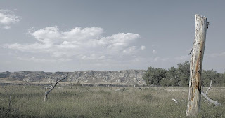
I was thinking to myself on the tram home the other night: what defines my photographic style? Do I, in fact, have one? I was coming to the conclusion that no, I did not and that much of my work recently was getting a bit "average Joe" - derivative snapshot stuff. maybe not, maybe so. I'm pretty certain it hasn't been distinctive.
Then Mike Johnston posted on the self same subject, which prompted me to look afresh at some of my recent stuff. I also thought back to some of the work I'd done last year that i really liked. So here are some of the results of that thinking, several presented together so hopefully my ideas can be seen running through the set.


Posted by
doonster
at
05:18
0
comments
![]()
Labels: Pictures, Thoughts on art, Travel
Getting it in the frame
First up, I spend quite a bit of thought time (although that may be short in clock time) looking around and at things. If I see something interesting, I figure out what interested me and then look for an angle to best get that interest to the picture. These days, I usually go with the immediate reaction to something to determine its interest. In the past I might have spent more time considering whether it would make a keeper, these days I'm happier to throw stuff out than I was then.
Posted by
doonster
at
04:53
0
comments
![]()
Labels: Thoughts on art, Workflow
Tuesday, 9 October 2007
Not as it first appeared
For me, an interesting image.
Normally, I'm pretty sure of what I'm photographing, by which I mean the intention I wish to convey. This was one of those that was not quite the same.
Once in a while, I'll shoot something interesting and then find something else entirely the attracts me to the result. In this case it was the interesting geometric shapes that first drew me to take the picture but then it became about something else entirely.
As ever, the real attraction of the Rockies for me is the demonstration of powerful natural forces: the upthrow of the strata and the glacial erosion.
For me, the caption says it all.
Posted by
doonster
at
06:21
0
comments
![]()
Labels: Thoughts on art, Travel
Darkness, metering & mathematics
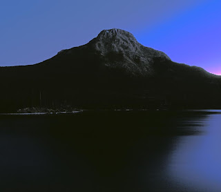 Evening falls, Alberta, September 2007
This was a 1 minute expose & a lot of post-process. Could easily have gone to 4-5 minutes
During the last trip to Canada I was experimenting with long exposures (like the one above). here, I'm talking the stuff measured in minutes. Cliched stuff: mountains, lakes, setting sun etc. Quite a few were with the 20D but I'm not a fan of digital long exposures: too much shadow noise.
Having my (relatively new) medium format with me, I tried some film-based long exposure, too. Should be better, no noise to contend with for one. Any colour cast can be dealt with by the software. trouble is, it requires metering in tricky conditions and offsetting for middle grey and reciprocity (this last is pretty minimal with modern film). This is where my rubbish mental arithmetic fails me. I keep adjusting in the wrong direction or by too few stops. You'd never think that I deal in numbers & advanced maths all day.
I've just picked up the developed film from the shop and so the upshot is the image here (which is pretty rubbish - certainly compared to what I had in mind) was the best I got. More work needed: or a meter that does all the calcs for me!
Posted by
doonster
at
03:55
0
comments
![]()
Saturday, 6 October 2007
The feedback on Lightzone 3.1
 Bridge over Le Sereine, France, June 2007
Colin Jago, of auspiciousdragon, posted the following comment on my thoughts on Lightzone 3.1:
"I'm still using Lightzone 2.3 (I hit a bug in 2.4 and trashed the installation). It has always frustrated me. It has loads of potential but the guiding hand behind the product seems out of touch."I must say, I sympathise. I've found more than 1 bug in 2.4 but felt the tool improvements were worth living with them - just.
From my original observations I contacted Lightcrafts about the new lzn.jpg files. What I wanted to know was whether there was a way of editing the info in them as per the XML .lzn files of old. (When the jpg sidecar is opened in a text editor all the old XML data is visible, just not editable.)
Their response: "sorry, you can't create lzn files from 3.1" - an answer to a question never posed.
I replied as much and asked if there were plans to return the lzn files - that was a week ago, no response since.
Not only are the development team wandering in the wilderness, the support team has upped and joined them.
When I first signed up the LZ, response was quick and effective. Just like the product, I want the old stuff back, please.
Thursday, 4 October 2007
Is the effort worth it all?
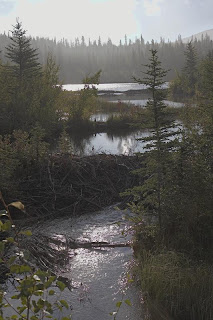 Beaver's domain, Alberta, September 2007
I'm sure the web version doesn't do the subtlety of such an image justice
So this is one of my favourite images from my last Canada trip. Simple yet complex. it displays a whole range of issues associated with my feelings coming from the early morning exploration and contemplation.
thing is it was a single capture - 1 shot, 1 view. No fancy preparation and no experimenting with exposure and framing. no search for the perfect image. yet no worse for all that (maybe better).
Should I just point and shoot? Or is it such that sometimes effort is required, sometimes not?
I don't have the answers, I'll just enjoy the results as they happen and hope I regret nothing.
Posted by
doonster
at
06:49
0
comments
![]()
Labels: Thoughts on art, Travel
Wednesday, 3 October 2007
Another way to print your books
I didn't give the credit at the time, but hendrik replied to my post on bobbooks with an interesting note on a similar service - blurb. Whilst based in the US, they send to Europe. There are 2 distinct differences, firstly that they used a network of print shops and so cannot guarantee consistency, leading to the second point that a guide to blurb colour management has been put together. Find that here.
This latter point is really useful - I might well give blurb a go with a project I've got that wants printing in this way.
Posted by
doonster
at
14:06
0
comments
![]()
Labels: Random
Unusual inspiration
It's not often I can say that photos look better on the web.
When I posted the above picture here, I noted that I was unsure where to go with it. I certainly like it a lot - it properly captures the mood & feeling of the time I was there but the deep shadows were proving tricky. Seeing the web version, with the very "blocky" yet subtle differences in the shadows I figured what changes I wanted: very little.
The top image is the result (almost). This is going to be tricky to print so I actually have a few versions for printing to try and get the right effect in the shadows. There is very little in the way of adjustments: a couple of areas of clouds have contrast curves and there is a small amount of contrast work in the shadows to ensure that the different hills are distinct in print. That's about it - I'm not even bothering with sharpening, which ruins the overall effect in this case.
Posted by
doonster
at
12:13
0
comments
![]()
Labels: Thoughts on art, Travel
Tuesday, 2 October 2007
Canon EF-S 17-55 f/2.8 IS: a footnote
In my part 2 of my 2 part review (part 1 here) I made the statement regarding tilt of the lens due to the zoom mechanism. I left the statement hanging somewhat and realised that I should do a check to see if the impact is as expected.
As a result, I've run tests on a series of targets with perpendicular features (wall & floor) to test for non-parallel focal plane.
Test run by taking shots at f/2.8, manual focused on the wall at the centre of the lens. I've then checked the relative focus of the paving slabs on the floor to see where the focal point lies. If the focal plane is parallel to the film plane, the wall should be in equal focus, if not, there will be a point on the slabs that is sharper.
Overall conclusion: at a variety of shorter ranges (less than hyperfocal distance), focus accuracy and possibly depth of field (combined with sensor resolution) swamp any tilt effect. I've also discovered my 17-55/2.8 has a slight tendency to front focus (but that's another matter entirely).
Posted by
doonster
at
07:37
0
comments
![]()
Monday, 1 October 2007
Canon EF-S 17-55 f/2.8 IS: a review pt 2
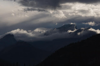 Receding sun, Alberta Rockies, September 2007
Image is RAW converted as shot - still unsure where to go with this one
At last, this is part 2 of a 2 part review. Part 1 is here.
Brief note from the last part: nomenclature - 17-55/2.8 refers to the Canon EF-S 17-55 f/2.8 IS lens and 17-40 refers to the EF 17-40 F/4L lens (I get fed up typing all that stuff).
Part 2: Tests and comparison
This part is a little more technical as I try to get to grips with some of the apparent performance I observed in the 17-55/2.8. I set out to answer 2 questions:
1. Does the 17-55/2.8 carry more contrast in the shadows than the 17-40, especially with medium exposures (4-10s)?
2. Does the 17-55/2.8 have more mid-tone contrast in general shooting conditions (daylight etc)?
These questions came from my subjective view on the images I was creating with the 2 lenses under a variety of conditions, especially the top image from my recent Canada trip.
In brief, the answer to both questions is "no but it may appear so". Read on to find out why but first something completely different...
2a. Alignment
I was striving to make testing conditions as constant as possible for these 2 lenses. I was being careful to use the same exposures, same focus targets for the same scene with careful control of the focal length for content.
One of the first things that I noticed, however, was that the 17-40 was not focusing on the same spot, in fact it was looking a little above the 17-55/2.8. Odd, I thought - needs some investigation.
I carefully set up a comparison horizontal shot test to look at target offset. This was done by setting measuring the distance between 2 marks on a vertical wall that were targeted in the dead centre of the central focus point for each lens.
Result: the 17-55/2.8 targets 0.3degrees below the 17-40. This was constant across the zoom range. Reason: "slop" in the mechanism for the zoom. As the 17-40 is fully enclosed and doesn't extend it keeps optic plane constant. For the 17-55/IS, however, the zoom extension mechanism has some slight play in it, resulting in a slight tilt downwards. Good news if your a landscape photog, not so good news for the close-up, wide open crowd.
Getting to the nub of things...
2b. Shadow detail
Here's the test subject, shot under tungsten at ISO100 and f/8. 4-10s exposures.
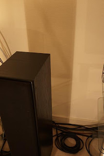
Before getting to the results, a note on test protocol. When i first ran the test shots in Av mode I found that the 17-40 was metering about 1/3stop faster (lower exposure) than the 17-55/2.8. It was also returning different auto-WB values. While all shots were taken in RAW mode, the WB values were affecting the software views (I used both Canon and PhaseOne software). I reshot in manual with a fixed WB value (4000K here).
Result: no noticeable difference in the shadow contrast (colour values), even at 200% magnification. Noise was pretty constant and resolved detail was the same.
I re-ran the tests with this view (green curtains):
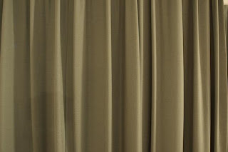
Same results.
One thing bothered me, though; the source of the colour balance and exposure differences. Leading to:
2c. Colour transmission & contrast
These things come together for a good reason, that should become apparent.
When I was looking at the previous results closer, especially examining the RGB histograms it was clear that the 2 lenses were giving different results. In the red channel, the 17-40 gives a top value of around 1-bit difference (assuming the software histogram scales are exponential) - i.e. half a "bar" on a 6-bar scale. For the green channel it is about 0.5-bit. Blue channels were identical.
Also linked to the, the R&G channels were definitely showing differences across the scale. The 17-55/2.8 was compressing the values as well as having a shorter tail at the high end (see image below).
 17-55/2.8 on left, 17-40 on right
 Exposure histograms from PhaseOne Capture One. Same WB, same exposure for each lens
17-40 clearly shows greater range in both red and green channels
What does this mean? The 17-55/2.8 has a lot more latitude for an expose-right strategy. Maybe 0.5-stop. This leads to higher shadow values and more latitude for opening up the mid-tone. This is why my qualification on the answers to the questions. While the RAW results return more contrast from the 17-40, highlights can be blown or the shadows blocked. The 17-55/2.8 gives more room to expose right, thus opens the shadows without blowing highlights. It has clearly been coated to optimise for digital.
Final Conclusions
The 17-55/2.8 is a nicely put together lens, gives excellent results in terms of edge-edge sharpness. IS is really useful, to the limit of subject motion. It is optimised for digital, allowing expose-right to be better used.
That said, I prefer the handling of the 17-40. The lack of play in the mechanism means true parallel focal plane (although the slight tilt from the 17-55/2.8 will help in some circumstances). It's also lighter and smaller so better for hiking. With the advent of the new highlight priority mode, the issue with greater range in R&G should be improved. If you're an IR shooter, the reduced red transmission from the 17-55/2.8 may work against you.
For me, I will continue to use them as I intended. The 17-40 will be my outdoor hiking lens, I'll use the 17-55/2.8 for available light & interior architecture and as a general purpose travel lens.
Posted by
doonster
at
04:50
0
comments
![]()


