There is a post & discussion, over at T.O.P., on how to get more detail out of the highlights in B&W and the issue of dynamic range versus film. It mostly revolves around the use of HDR techniques to extract the maximum information from a scene (multiple shots & bracketing) or file (multiple conversions).
As I commented, I've been using these techniques for colour work with some success but never thought to apply them to monochrome work. Having had a few difficult cases recently, I went back to take another look. Here are the results. In all cases - Capture one for the conversion (does the smoothest dark tone conversion, IMO), Photomatix Pro for HDR combination, Lightzone for final adjustments.
In this case, I did the HDR work in color then performed a conversion to B&W. There is clearly more detail in the far wall, and the water level in the opposite lock can be seen. Slight noise reduction necessary there to stop it looking too grainy compared to the rest of the image. Final print optimization not yet done.
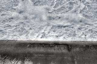
Here, I worked the conversion in B&W from the start, to see how that affected workflow. No real problem as far as I was concerned. The image has 2 lots of colouration applied which is why it appear to be a colour image. I much happier with the fine detail in the smooth water over the weir and the less aggressive specular highlights in the foam.
Overall, a success: not for universal use but good for tricky shots and more abstract work. Just as I apply it for colour work.


No comments:
Post a Comment
I like comments, especially constructive ones.
Comments get emailed directly to me before publishing , so if you want to get in touch drop a comment.
All comments moderated by me before being published, keeps the spam at bay.