Having got all the key elements decided, the rest of the work is about supplying supporting cast to balance the final look. Not too much work, but not so little that it stands out by the lack of detail/sharpness/saturation or whatever.
As ever for this picture, increasing the contrast to bring out the subtle shading is a prime goal, then some light sharpening and a slight reduction in saturation.
There are also a few dark areas that need lightening slightly, again to bring balance to the overall view. Each spur & hill has been treated separately but the modifications are generally very similar.
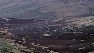
Here is a crop of the results.

If you look carefully the effect of reducing the saturation slightly on the right versus increasing slightly on the valley can be see, making the valley stand out. This is much more effective in a large image.


No comments:
Post a Comment
I like comments, especially constructive ones.
Comments get emailed directly to me before publishing , so if you want to get in touch drop a comment.
All comments moderated by me before being published, keeps the spam at bay.