Friday, 22 June 2007
Away on vacation
I'm off on a week's vacation in a couple of hours. 7 days cycling across France with a group of friends heading for Alpe d'Huez. Another cycling challenge and hopefully some interesting photographic opportunities as we cross the Burgundy and Cote d'Or regions. Might even be a couple of glasses of wine along the way.
As a result, no blogs for nearly 10 days.
Posted by
doonster
at
15:36
1 comments
![]()
Labels: Travel
Blencathra part 5: final image and monochrome
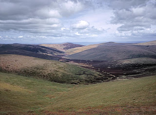
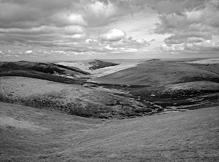
Sky is converted with an orange filter, foreground with a magenta and the rest with a yellow filter. Each picked for its positive effect on contrast and brightness.
Here's the result:
Posted by
doonster
at
08:15
0
comments
![]()
Blencathra part 4: the rest of the image
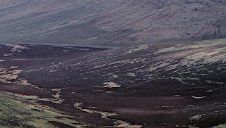
As ever for this picture, increasing the contrast to bring out the subtle shading is a prime goal, then some light sharpening and a slight reduction in saturation.
Posted by
doonster
at
08:12
0
comments
![]()
Good art, bad art, fine art
I've been reading quite a lot recently about views on art, critics, reviews, the nature of fine art photography etc. this got me thinking about the way I view these various ideas about art & photography (not mutually exclusive as that statement might imply). Here, then, my thoughts:
Good art: art has some sort of purpose to it, a reaction invoked in the viewer. The reaction invoked may, or may not, be what the artist intended but it is there. Good art, for me, is that which invokes the desired reaction in a positive manner - the "I get that, I know what the artist was about" sort of reaction. that doesn't mean that your reaction has to be positive ("I feel all warm and fuzzy"). Succeeding in invoking feelings of anger or disgust may be just as much good in this context. "I like it art" is only a sub-set of Good Art.
Bad art: by it's very nature, not good art. If the artist fails in intentions or the viewer is switched off on viewing, then the work, for that viewer, is bad. I highlight the viewer aspect because art really is in the eye of the beholder. George Barr gets to the nub of this issue talking about not liking art forms. I'll get back to this idea later.
Fine art: sometimes, good or bad, art is well executed and there is inherent quality merely in the presentation and execution of the work. this is Fine Art as I see it. Generally for photography we are talking about great prints with depth of tone, fine detail, broad contrast range. It's the mater of details, the individual brush strokes, seeing the chisel marks, whatever. Such works can be appreciated purely for the craftsmanship, independent of the Goodness demonstrated.
Critical appreciation is all about defining Good Art in ones own mind. I had initially thought that Good Art can stand by itself as an independent work but there is no such thing. all of our views on art are coloured by our experiences, culture, previous exposure to art. the same is true of reviewers: their judgements flow from the works that went before, internal comparisons with their own frame of reference. No one can truly say they are judging a work on its own merits. this is why Good Art and Bad Art must be personal judgements - while the success of a show or gallery may be dependent on the opinion of reviewers, they do not have exclusive insight into the nature of Good and Bad. One must decide for oneself.
Posted by
doonster
at
02:04
1 comments
![]()
Labels: Thoughts on art
Wednesday, 20 June 2007
Blencathra part 3: focal points
In this case, I've focussed on contrast enhancement, some added brightness and then sharpening. Minimum colour adjustment: I like the way the colours are coming off the film. One thing that I do, though, is to increase the saturation slightly for the main focal point, here the Fell in the distance. I shall probably also reduce the saturation of the secondary areas. Our eyes are much more sensitive to colour in the centre of our vision, and so this fools the brain, drawing the eye where I want it to go. I think it is more effective and less obtrusive than substantial differences in sharpness that is often used for the same effect. Not that I don't use the latter trick, of course.
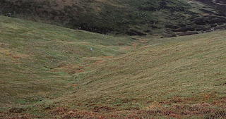
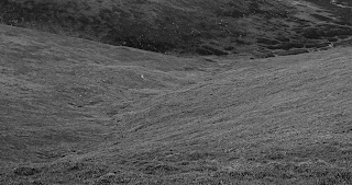
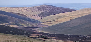
Last word here: there are 2 more installments to come - the secondary parts of the image and the final result (together with black and white conversion).
Posted by
doonster
at
06:42
0
comments
![]()
Naming the image
Doug Stockdale has recently been posting (here and here) about various ways of naming some of his images in the ongoing Bad Trip - Sad Trip project.
It occurred to me that his very carefully studied manner of determining a suitable final title is very much in opposition to mine. I tend to work instinctively for titles. Unless it is a straight proper noun, the name I apply is usually a direct reflection of the initial attraction for me to take the picture in the first place.
Maybe this stems from my general aversion to project based photography. The titles then flow from the instinct that draws me to raise the camera to my eye in the first place. From a personal point of view, I feel that then gives me a closer connection to my photographs because they reflect the mood I was in at the time.
Then again, I might just be good at coming up with names.
Posted by
doonster
at
05:06
1 comments
![]()
Labels: Thoughts on art
Tuesday, 19 June 2007
Blencathra part 2: the sky for perspective
The first area I usually tackle in a shot like this is the sky. For me it sets the tone of the whole shot and is the best way to give a great sense of depth to the final print. When looking at similar images from others I often think that the total impact is lost from a wishy-washy (technical term) sky.
I find cloudy skies quite easy to get good results. There are smooth tonal transitions built in which makes noise reduction, spotting etc quite easy. Soft edges abound so sharpening isn't critical. Most of the colour information is at the high end of the dynamic range and so, as long as I've not blown the highlights (not really an issue when the source is film) there is plenty of scope for opening the contrast with curves or equivalent.
Here are the steps I took with this particular image (mostly working in Lightzone, my preferred editor):
Slight colour & white balance adjustment - there as quite a blue cast to the whole sky, which didn't quite work for me
Increase the contrast in 2 steps: first with a Zonemapper to pull the darker regions down (as with S-curves in PS) and then a small amount, large radius USM (for micro contrast) - here I used A.R.T. 20:100:0.
Finally, a slight lightening of the 2 dark areas on either side of the sky, to stop the dark over-powering the whole thing. The tops of the hills visible here have had no adjustments yet.
Once done, I also took a single pass B&W filter, to see in monchrome will work. In general, I pick lack and white for images that are largely about tonal variation rather than strong colours. this is a candidate. Here's the result before dodging and burning:
Finally, a tip for large images in Lightzone. Those who use LZ regularly will probably know that it's not too great with large images (100MB+) so a 300MB 16-bit LF file is going to make it struggle. To help it cope I use the crop tool to isolate the part I'm working on (hence the crops in these samples), or even a section of that part (say just the right hand side of the sky). that cuts down the size of the working file. Once I'm happy, I disable all the aadjustments, reset the crop and then crop the next section. The last step will be to activate all the adjustmetns together. I just need to take care that I do occassional checks between adjacent regions for compatibility (to avoid harsh transitions). this way, LZ works well, and handles the final adjustment well. What seems to slow it down is all the intermediate work on the entire image while editting.
Posted by
doonster
at
03:42
0
comments
![]()
Sunday, 17 June 2007
Blencathra part 1: preparing the scan
When I returned to review the original scan I'd made of the photo, I found that it was out of focus in large parts. probably due to me making the final scan at the end of a long scanning session. Over time te scanner heats up, thus warming and warping the original - only a temporary effect.
So I went back to re-scan it, retesting the focus height on the holder. I also tweaked the brightness, curve and black & white points. First scan was rubish - i'd forgotten to brush it for dust and so it was very dirty. rebrush, rescan, tweak the USM settings (I found my final scan frame and test section had different settings) and I was away.
this, to me, is the equivalent of RAW development in digital. I try and do as many things as I can at the first set to capture as much information to the working file as possible. that said, I am also only using a fairly light touch in each of the settings - if I overcook the settings, then the working file is much harder to work with.
The final steps in preparing the working file are dust removal (using Dust & Scratches in Photoshop on the affected areas), some noise removal (Neat Image) and a little USM (similar to the settings I use on RAW files). In this case I also aded a small amout (5%) of shadow lightening and similar level of mid-tone contrast.
Now the file is ready for the real work on the individual areas of the picture. In this cae I think about 5-6 in total: clouds/sky, foreground grassy area, one for each of the individual hills & spurs and finally the valley floor.
Next installment - the sky.
Posted by
doonster
at
18:10
2
comments
![]()
Friday, 15 June 2007
Pushing the noise envelope
Steve Gillette, in a comment, provided a link about Kodak's new sensor filter array. dpreview are also carrying the story. Is this really true, or is something missing?
I did some thinking on this, and I'm not convinced they've got it nailed. The claim is that by using the luminance pixels noise is reduced. I'm sure it is - these pixels effectively capture 3 times the light of filtered ones. Then again, why didn't they go with an LAB type array, why use RGB as well as luminance?
Then there is the resolution thing. Without colour resolution, the luminance "resolution" is either good for B&W or is just noise in itself. (If one wanted B&W, then one would not need the filter array anyway.) With colour pixels now spaced at 4 sites, compared to 2 sites for a Bayer array, the resolution that can be offered is only going to be that of a sensor with a quarter the pixels. Any interpolation is just guessing, it doesn't provide true resolution. If there were only a quarter of the pixels, noise would be inherently lower as the sensors would be that much larger. I'm sure that the extra interpolation will lead to colour fringe effects. Physics getting in the way again.
Of course, Kodak also have some fancy software algorithms to go with the new array which I'm sure helps with noise reduction but that could well be the crux of this working. then again, Canon are doing a really good job with high ISO performance (in large sensors at least) and there must a lot of algorithms involved there. I'm sure I read somewhere that Canon are also increasing the sensor site size by reducing the size of all the other stuff on the chip: less gaps, bigger sites.
Posted by
doonster
at
15:23
2
comments
![]()
Thursday, 14 June 2007
How much resolution is enough?
For me, I'm trying to capture enough of what I see to express in print what I felt & saw in reality. Sometimes that means a lot of detail, sometimes not.
Posted by
doonster
at
21:42
0
comments
![]()
Tuesday, 12 June 2007
The definition of artistic terms
Posted by
doonster
at
17:45
3
comments
![]()
Labels: Thoughts on art
Further thoughts on scanning resolution
I mentioned in the previous post that I ran a series of resolution tests at 1200dpi multiples. This was based on the received wisdom that I had on sticking to multiples of the scanners native resolution. I then discovered that the scan settings can be used to set an output size and resolution, the software doing the rest. I gave it a go.
I picked a given output size (55cm, IIRC for a 60cm print) at 300dpi. That led to an odd enlargement factor. tested the results - I couldn't really pick up any difference pixel peeping. maybe a slight degradation at 100%, certainly nothing that'll show up on print. This will simplify my workflow: get a general crop from the pre-scan, set the desired output & away I go.
The other thing I've been pondering comes from Paul Butzi's post on digital versus medium format. I responded that I reckoned MF could do better. This is based on the resolution testing I outlined below. If I can scan a 645 (56mm wide) film at 3600dpi, that would yield 670mm (26") image at 300dpi print. Larger at 4800dpi. I might imagine that this sort of enlargement would push optical enlargement (darkroom) but seems well within the bounds for scanning to digital today. I've seen some 5D and M8 files up close and they are very good, but not as much detail as I might get at those scan resolutions. Of course, if the film isn't up to it in terms of grain etc the point is moot (at ISo400 I'd reckon on digital winning, no problem). If I'm still getting extra detail at 3600dpi then that really opens the window of opportunity for enlarging film.
There are, of course, other factors relating to colour & contrast etc but for out and out resolution I think current scanner technology is keeping film in the hunt (if you've got the patience for the lengthened time required for film).
Posted by
doonster
at
06:28
0
comments
![]()
Getting the most from a scan
This past week I've been working on scanning the LF work from my trip to the Lake District. It's been a voyage of discovery. As part of the initial work, I've been experimenting with getting the best from my scanner (an Epson V750 Pro flatbed), working through the vast array of variables on offer with the SilverFast scanning software it came with.
This is what I've found (so far):
Resolution - the scanner has 2 lenses - 4800dpi and 6400dpi, with output up to 9600dpi. Obviously for a 4x5 sheet I'm not going to go that high but the question is how high and is there some sort of optimum? I ran tests at 1200, 2400, 3600, 4800 dpi (on small sections - the last would be a monster file if I tried the whole image). I was looking for maximum amount of detail. At 1200 it's useless at any size - a lot of pixelation, limited detail, only good for document scans. 2400 renders good detail, smooth at 100% on screen. 3600 yields more detail than 2400, again smooth results. 4800 shows no more detail that 3600 - it's effectively a native enlargement. I think at 3600dpi it could be getting to the limit of the film.
Focus - the film holders can bet set at different heights to get optimum focus. This is important. In focus 2400 is as good as out of focus 3600. It's not just in clarity and detail, colour saturation and contrast are better too. Interestingly, the height settings for the 6x9 and 4x5 holders work out different. Not sure why.
Sharpening settings - there is a huge array to pick from. In the end I've settled for a light USM setting as giving consistently good results across the whole image. As I'm using fine grain film (Fuji Astia & Provia 100) grain effects are limited and easily removed in processing.
Number of passes - this thing can do up to 16 passes. I tried up to 8. There was slight improvement from 1 to 2, nothing noticeable beyond that. I tested by scanning a dark area then expanding with curves until near posterization. No real difference in noise that I could tell beyond 2 passes. Downside of lots of passes is the film gets hot and starts to buckle, seriously degrading results.
Dust & scratch removal - Digital ICE is built in and there are a couple of other options. I'm not touching them for the large stuff. It's easily removed in processing if I clean the surfaces before scanning. I found ICE froze the computer when trying an entire 4x5. Cleaning up only takes 5 minutes - I'm using selective application of dust & scratches tool in PS.
Would I want a drum scan? Can't see why. I get fine resolution towards the limit of the film, scanning to easily produce 40" plus enlargements from a 4x5 with smooth tones, limited grain and good saturation and contrast. I'm finding I need very little processing to get excellent results.
Explanation of the crop with which I've illustrated this post: this is a detail from one of the shots I've been working on (straight from the scan with a little extra sharpening). it shows a building amongst the trees in the valley. What's the big deal? I've been to this spot many times and didn't know it was there. I'm pretty sure I can't see it with the naked eye yet I'm picking it up clearly with a 120mm lens on 4x5 (that's fairly wide) and easily picking it up on the scan. Does one need better results than that?
Posted by
doonster
at
05:51
2
comments
![]()
Saturday, 9 June 2007
Anton Corbijn on Anton Corbijn
I've just watched a documentary on Dutch TV about Anton Corbijn, photographer to the rock music world. I'd not heard of him before (shame on me, really) but have seen many of his images. Pretty much anyone who's made popular music in the last 25 years, and many more besides, has had their photo taken by him.
I like the gritty, grainy style he has and the way it draws interesting character from his subjects.
He had some interesting things to say, too (I paraphrase in translation here):
On technique: my technique is quite sloppy and that results in a lot of out of focus ("unsharp" as it is in Dutch) areas. I don't think this detracts from the overall quality of the image, the composition, the subject.
On light: I like the light at the end of the day just before it gets dark. The contrast is even and the scene flat which leads to interesting and strong composition.
On celebrity: I like to photograph beauty but not in the traditional, glamorous sense of celebrity. I like to draw on the beauty of character, ideas, personality.
On fame: I used to think of myself as a sort of underground photographer, away from the mainstream. Now I have become the mainstream but I hope that doesn't mean I've lost the inherent qualities of the image that I had before.
Looking at the woks presented in the programme and a quick search on his images I must say it is one of the strongest styles of "people photography" I think I've ever seen. Well worth checking him out.
Posted by
doonster
at
17:02
0
comments
![]()
Labels: Photographers
Sunday, 3 June 2007
In search of a challenge
I realised this evening that the thing that keeps me enthused about any particular activity, and life in general, is the taking on of a challenge. Something that will push me to learn new things or improve myself in some way.
And so it is with photography. I'm never happy producing pictures of the same consistent quality time after time, or focusing on particular subjects. i like to push further, try harder, constantly get better quality images. that holds for both technical as well as artistic content. It might also explain some of my "shiny kit syndrome": never satisfied with the quality I'm getting, I'm after something more. hence the purchase this week of 2 new lenses (the canon EF17-55 f/2.8 & EF70-200 f/4 IS, both very nice) to improve areas of my work. Also explains why I bought an LF camera.
There will come a point when I'm happy technically and will truly focus on content. Hopefully with the next 12 months or so. Not that I'm not striving in that area. too.
A reason I came to this realization was reflecting on my cycling. Now I have a bike for every occasion, it is down to me to improve my fitness or take on different challenges (greater distances, touring, new countries) - I focus on turning the pedals and completely forget the equipment under me.
Posted by
doonster
at
03:17
0
comments
![]()
Labels: Thoughts on art, Workflow


