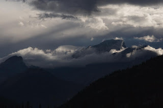
Friday, 12 October 2007

Defining my style

I was thinking to myself on the tram home the other night: what defines my photographic style? Do I, in fact, have one? I was coming to the conclusion that no, I did not and that much of my work recently was getting a bit "average Joe" - derivative snapshot stuff. maybe not, maybe so. I'm pretty certain it hasn't been distinctive.

Then Mike Johnston posted on the self same subject, which prompted me to look afresh at some of my recent stuff. I also thought back to some of the work I'd done last year that i really liked. So here are some of the results of that thinking, several presented together so hopefully my ideas can be seen running through the set.

Middle Lake, Alberta, September 2007


Getting it in the frame

There was an interesting discussion over at the Landscapist on what & how to teach in photography. Led me to think: what is the process I use to make an image?

I see it in 3 steps:

1. Looking for the subject

2. Capturing the subject

3. Processing the image

First up, I spend quite a bit of thought time (although that may be short in clock time) looking around and at things. If I see something interesting, I figure out what interested me and then look for an angle to best get that interest to the picture. These days, I usually go with the immediate reaction to something to determine its interest. In the past I might have spent more time considering whether it would make a keeper, these days I'm happier to throw stuff out than I was then.
Second is the actual getting it to the capture medium. This involves the mechanics of the camera, setting up tripod, careful checking of angles for clashing elements and other such technical stuff. I've never really specifically regarded compositional devices such as rule of 3rds, leading lines etc. Generally, stuff just looks right through the viewfinder. Sometimes I'm looking to bring specific elements together in a specific way. Mostly, though, it is about getting the stuff I want into the frame.

Lastly there is the bit about getting the image out of the camera and to the print (I always think of print as the final destination, whether it is or not). Apart from all the colour balance, contrast, sharpening etc there is the important bit on cropping. George Barr covers this much better (e.g. here) but my approach is similar to his - check the edges the ensure the wanted stuff is in and the unwanted (e.g. distracting) is out. Once in a while I can't quite crop out all that I want so I've been known to do a little cloning at the edges to remove the last trace of intruding elements. I don't care if that's cheating.

There it is - no formal art training here, I do look at quite a lot of pictures to see what works for me or not but that's the limit. I end up happy with the results and that's what matters to me.

Tuesday, 9 October 2007

Not as it first appeared

Age and discovery, Alberta, September 2007

For me, an interesting image.

Normally, I'm pretty sure of what I'm photographing, by which I mean the intention I wish to convey. This was one of those that was not quite the same.

Once in a while, I'll shoot something interesting and then find something else entirely the attracts me to the result. In this case it was the interesting geometric shapes that first drew me to take the picture but then it became about something else entirely.

As ever, the real attraction of the Rockies for me is the demonstration of powerful natural forces: the upthrow of the strata and the glacial erosion.

For me, the caption says it all.

Darkness, metering & mathematics

Evening falls, Alberta, September 2007
This was a 1 minute expose & a lot of post-process. Could easily have gone to 4-5 minutes

During the last trip to Canada I was experimenting with long exposures (like the one above). here, I'm talking the stuff measured in minutes. Cliched stuff: mountains, lakes, setting sun etc. Quite a few were with the 20D but I'm not a fan of digital long exposures: too much shadow noise.

Having my (relatively new) medium format with me, I tried some film-based long exposure, too. Should be better, no noise to contend with for one. Any colour cast can be dealt with by the software. trouble is, it requires metering in tricky conditions and offsetting for middle grey and reciprocity (this last is pretty minimal with modern film). This is where my rubbish mental arithmetic fails me. I keep adjusting in the wrong direction or by too few stops. You'd never think that I deal in numbers & advanced maths all day.

I've just picked up the developed film from the shop and so the upshot is the image here (which is pretty rubbish - certainly compared to what I had in mind) was the best I got. More work needed: or a meter that does all the calcs for me!

Saturday, 6 October 2007

The feedback on Lightzone 3.1

Bridge over Le Sereine, France, June 2007
Here, I was playing around with softening effects on an otherwise dull image. I'm looking for ways to add particular feelings to photos.

Colin Jago, of auspiciousdragon, posted the following comment on my thoughts on Lightzone 3.1:
"I'm still using Lightzone 2.3 (I hit a bug in 2.4 and trashed the installation). It has always frustrated me. It has loads of potential but the guiding hand behind the product seems out of touch."
I must say, I sympathise. I've found more than 1 bug in 2.4 but felt the tool improvements were worth living with them - just.

From my original observations I contacted Lightcrafts about the new lzn.jpg files. What I wanted to know was whether there was a way of editing the info in them as per the XML .lzn files of old. (When the jpg sidecar is opened in a text editor all the old XML data is visible, just not editable.)
Their response: "sorry, you can't create lzn files from 3.1" - an answer to a question never posed.
I replied as much and asked if there were plans to return the lzn files - that was a week ago, no response since.

Not only are the development team wandering in the wilderness, the support team has upped and joined them.

When I first signed up the LZ, response was quick and effective. Just like the product, I want the old stuff back, please.

Thursday, 4 October 2007

Is the effort worth it all?

Beaver's domain, Alberta, September 2007
I'm sure the web version doesn't do the subtlety of such an image justice

So this is one of my favourite images from my last Canada trip. Simple yet complex. it displays a whole range of issues associated with my feelings coming from the early morning exploration and contemplation.

thing is it was a single capture - 1 shot, 1 view. No fancy preparation and no experimenting with exposure and framing. no search for the perfect image. yet no worse for all that (maybe better).

Should I just point and shoot? Or is it such that sometimes effort is required, sometimes not?

I don't have the answers, I'll just enjoy the results as they happen and hope I regret nothing.

Wednesday, 3 October 2007

Another way to print your books

I didn't give the credit at the time, but hendrik replied to my post on bobbooks with an interesting note on a similar service - blurb. Whilst based in the US, they send to Europe. There are 2 distinct differences, firstly that they used a network of print shops and so cannot guarantee consistency, leading to the second point that a guide to blurb colour management has been put together. Find that here.

This latter point is really useful - I might well give blurb a go with a project I've got that wants printing in this way.

Unusual inspiration

Receding sun, Alberta Rockies, September 2007

It's not often I can say that photos look better on the web.

When I posted the above picture here, I noted that I was unsure where to go with it. I certainly like it a lot - it properly captures the mood & feeling of the time I was there but the deep shadows were proving tricky. Seeing the web version, with the very "blocky" yet subtle differences in the shadows I figured what changes I wanted: very little.

The top image is the result (almost). This is going to be tricky to print so I actually have a few versions for printing to try and get the right effect in the shadows. There is very little in the way of adjustments: a couple of areas of clouds have contrast curves and there is a small amount of contrast work in the shadows to ensure that the different hills are distinct in print. That's about it - I'm not even bothering with sharpening, which ruins the overall effect in this case.

Tuesday, 2 October 2007

Canon EF-S 17-55 f/2.8 IS: a footnote

In my part 2 of my 2 part review (part 1 here) I made the statement regarding tilt of the lens due to the zoom mechanism. I left the statement hanging somewhat and realised that I should do a check to see if the impact is as expected.

As a result, I've run tests on a series of targets with perpendicular features (wall & floor) to test for non-parallel focal plane.

Test run by taking shots at f/2.8, manual focused on the wall at the centre of the lens. I've then checked the relative focus of the paving slabs on the floor to see where the focal point lies. If the focal plane is parallel to the film plane, the wall should be in equal focus, if not, there will be a point on the slabs that is sharper.

Overall conclusion: at a variety of shorter ranges (less than hyperfocal distance), focus accuracy and possibly depth of field (combined with sensor resolution) swamp any tilt effect. I've also discovered my 17-55/2.8 has a slight tendency to front focus (but that's another matter entirely).

Monday, 1 October 2007

Canon EF-S 17-55 f/2.8 IS: a review pt 2

Receding sun, Alberta Rockies, September 2007
Image is RAW converted as shot - still unsure where to go with this one

At last, this is part 2 of a 2 part review. Part 1 is here.
Brief note from the last part: nomenclature - 17-55/2.8 refers to the Canon EF-S 17-55 f/2.8 IS lens and 17-40 refers to the EF 17-40 F/4L lens (I get fed up typing all that stuff).

Part 2: Tests and comparison

This part is a little more technical as I try to get to grips with some of the apparent performance I observed in the 17-55/2.8. I set out to answer 2 questions:
1. Does the 17-55/2.8 carry more contrast in the shadows than the 17-40, especially with medium exposures (4-10s)?
2. Does the 17-55/2.8 have more mid-tone contrast in general shooting conditions (daylight etc)?

These questions came from my subjective view on the images I was creating with the 2 lenses under a variety of conditions, especially the top image from my recent Canada trip.

In brief, the answer to both questions is "no but it may appear so". Read on to find out why but first something completely different...

2a. Alignment

I was striving to make testing conditions as constant as possible for these 2 lenses. I was being careful to use the same exposures, same focus targets for the same scene with careful control of the focal length for content.
One of the first things that I noticed, however, was that the 17-40 was not focusing on the same spot, in fact it was looking a little above the 17-55/2.8. Odd, I thought - needs some investigation.

I carefully set up a comparison horizontal shot test to look at target offset. This was done by setting measuring the distance between 2 marks on a vertical wall that were targeted in the dead centre of the central focus point for each lens.
Result: the 17-55/2.8 targets 0.3degrees below the 17-40. This was constant across the zoom range. Reason: "slop" in the mechanism for the zoom. As the 17-40 is fully enclosed and doesn't extend it keeps optic plane constant. For the 17-55/IS, however, the zoom extension mechanism has some slight play in it, resulting in a slight tilt downwards. Good news if your a landscape photog, not so good news for the close-up, wide open crowd.

Getting to the nub of things...

2b. Shadow detail

Here's the test subject, shot under tungsten at ISO100 and f/8. 4-10s exposures.
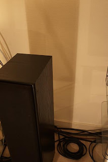


Before getting to the results, a note on test protocol. When i first ran the test shots in Av mode I found that the 17-40 was metering about 1/3stop faster (lower exposure) than the 17-55/2.8. It was also returning different auto-WB values. While all shots were taken in RAW mode, the WB values were affecting the software views (I used both Canon and PhaseOne software). I reshot in manual with a fixed WB value (4000K here).

Result: no noticeable difference in the shadow contrast (colour values), even at 200% magnification. Noise was pretty constant and resolved detail was the same.

I re-ran the tests with this view (green curtains):
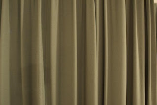

Same results.

One thing bothered me, though; the source of the colour balance and exposure differences. Leading to:

2c. Colour transmission & contrast

These things come together for a good reason, that should become apparent.

When I was looking at the previous results closer, especially examining the RGB histograms it was clear that the 2 lenses were giving different results. In the red channel, the 17-40 gives a top value of around 1-bit difference (assuming the software histogram scales are exponential) - i.e. half a "bar" on a 6-bar scale. For the green channel it is about 0.5-bit. Blue channels were identical.
Also linked to the, the R&G channels were definitely showing differences across the scale. The 17-55/2.8 was compressing the values as well as having a shorter tail at the high end (see image below).
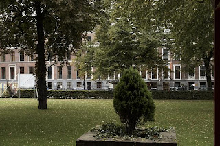
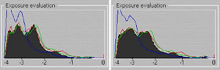
17-55/2.8 on left, 17-40 on right
Exposure histograms from PhaseOne Capture One. Same WB, same exposure for each lens
17-40 clearly shows greater range in both red and green channels


What does this mean? The 17-55/2.8 has a lot more latitude for an expose-right strategy. Maybe 0.5-stop. This leads to higher shadow values and more latitude for opening up the mid-tone. This is why my qualification on the answers to the questions. While the RAW results return more contrast from the 17-40, highlights can be blown or the shadows blocked. The 17-55/2.8 gives more room to expose right, thus opens the shadows without blowing highlights. It has clearly been coated to optimise for digital.

Final Conclusions

The 17-55/2.8 is a nicely put together lens, gives excellent results in terms of edge-edge sharpness. IS is really useful, to the limit of subject motion. It is optimised for digital, allowing expose-right to be better used.

That said, I prefer the handling of the 17-40. The lack of play in the mechanism means true parallel focal plane (although the slight tilt from the 17-55/2.8 will help in some circumstances). It's also lighter and smaller so better for hiking. With the advent of the new highlight priority mode, the issue with greater range in R&G should be improved. If you're an IR shooter, the reduced red transmission from the 17-55/2.8 may work against you.

For me, I will continue to use them as I intended. The 17-40 will be my outdoor hiking lens, I'll use the 17-55/2.8 for available light & interior architecture and as a general purpose travel lens.

Sunday, 30 September 2007

The power of a photograph

I wrote a post on the difference between great photography and important photography a while back. On a similar theme, I've just watched the Clint Eastwood double-bill on Iwo Jima: "Letters from Iwo Jima" and "Flags of our Fathers". 2 great movies that must be seen together, IMO, that also follow the modern war-movie trend of gory over glory.

That aside, the American side of the story (Flags) is all about the power of the famous photograph of the raising of the flag atop Mt Suribachi. Truly a powerful image that probably inspired a nation. A a moment, though, the context is not evident from the picture and it is often taken well out of context - not to mention that it was a replacement flag anyway.

The thing that struck me most, however, about the photography came as the credits rolled (which, for once, I watched to the end). Alongside the credits is a slideshow of some of the original photos from that battle, almost all of which turn up in scenes in the film. What amazed me was that in the middle of a war zone, with limited equipment, the attached photographers could produce images of such quality and emotive power. A real display of artistic and technical ability in very difficult circumstances. Despite all that, it is one image taken in a moment of pause that lives on.

For more on Iwo Jima, there is a very useful website on the whole thing, with many of the other photos taken alongside the famous one.

Saturday, 29 September 2007

The smoothness of digital black and white

Cottonwood graveyard stump, Dinosaur Park, Alberta, August 2007

There has been some recent back and forth between Tim Atherton and Doug Stockdale on the nature of Black and White images in the digital age. Tim is generally complaining that digital B&W, whether direct from a digital camera or via a scan has too much of a "smooth" appearance. There is too little "texture" (for want of a better word) to the images - too sterile. Doug's response is (to greatly sumarise): it's all good, just different but care is needed with the deep shadows.

My thoughts overall: digital can be what you want, film you're stuck with the characterisitics of a given film but have an initial choice.

I have certainly been looking more critically at the darkest tones, though, for my black and white stuff. There are some times when I like an image without deep shadows but I do get the point that more attention needs to be applied to getting real blacks in there.
Telling tales, Tavistock, September 2007

I'm also not convinced that the grainy, tactile (for want of a better word) feel of film cannot be achieved with digital. In general, the noisefrom high-ISO shooting gives a nice textured feeling and is quite effective for difficult situations. Of course, the newest cameras arriving are pushing the noise levels down at high ISO.

Maybe this will lead to an active market in older digital cameras to provide that grainy feel.

Another useful website

I've added a link to Lloyd Chambers' diglloyd website & blog, a really useful resource for equipment stuff. Things I like about his site: the objective outlook, his strong opinions providing a counter to most of the stuff out in www land. It is also one of the few places where you can get side-by-side info on Nikon vs Canon, with no bias. Whilst I'm not (never have been) a fan or user of Nikon I think it's good to see the other side once in a while.

The key reason I've linked, though, is due to his manner of looking at lenses. This has informed some of my approach to evaluating my own lenses and the work I've done on my on-going EF-S17-55 review.

Thursday, 27 September 2007

Canon EF-S 17-55 f/2.8 IS: a review pt 1

Heidelberg Castle, July 2007

*UPDATE 30/9* added link to part 2.

This is part 1 of a 2 part review. Part 2 is here.

Why is it lens names are so long? Anyway, after shooting hundreds of photos and creating a bunch of images, I thought I'd share my observations on the Canon EF-S 17-55 f/2.8 IS (from here on in 17-55/2.8). This is not a scientific study, there are no test charts (don't even own one) but my real-world experiences. I own all the equipment, paid for from my own wallet.

Part 1: Personal observations

I'll be drawing comparisons between the 17-55/2.8 and the EF 17-40 f/4L (henceforth 17-40), which I also own. It's an abvious choice due to the focal lengths and useful fr me in that I bought the two lenses for very different reasons. The 17-40 was bought before the release of the 17-55/2.8 primarily for outdoor landscape work. I found I was increasingly using it indoors and so went for the faster aperture and IS of the 17-55/2.8. I have now been using the latter for quite a lot of landscape work from my travels.

1a. Handling

Both lenses are well made and handle nicely. They are definitely both a step up from low to mid range zooms. That said there are differences. the 17-55/2.8 extends on zoom and has zoom and focus rings reversed. It is not weather sealed. It is also quite a bit heavier and larger.

For these reasons, I actually prefer the 17-40 as an object. the zoom and focus are a little smoother, it sits in the hand a little better (due to smaller size and weight) and it a better choice for hiking. Somehow it just has that slight edge in quality feel. Purely subjetive, nothing to do with function.

That said, the location of the IS and AF buttons are the 17-55/2.8 are nicely placed and easy to find by touch. the same cannot be said for all Canon lenses.

1b. Aberrations/distortion etc

The 17-40 has quite a lot more distortion across the range. It is clearly noticeable at wide angle, even on the cropped 20D sensor. The 17-55/2.8 has very little. When I produce stitched images i do no pre-adjustment on distortion with this lens. It also produces nicely sharp images edge to edge even wide open. From this point of view, it is highly suited to indoor architecture - one of the reasons I've got it.

Preparing for lunch, Tavistock, September 2007

1c. Image Stabiliser

A key selling point and one of the few wide angle IS lenses around (although Canon has a couple more cheaper offerings).

The claim is 3 stops but quite frankly I've never got that low. In general there's been no need or subject movement makes the point moot. I'm certainly seeing 2 stops without problem but if you're shooting people at 1/10s they aren't going to be still long enough to worry.

Indoor static sujects it certainly helps but I find I have to brace myself as body sway can affect the pictures - I don't think IS works well on such low frequency, long wavelength motion.

It does, however, enable me to continue working indoors without flash which i like. Plus some location won't allow it anyway.

1d. Image qualities

I find that the 17-55/2.8 produces very good images. Nice mid-tone contrast, carries good shadow detail. Focus is swift & accurate, even in quite poor light. No problem using AF for exposures around the 8s mark.

There are 2 things I seem to notice (and I'll be testing for part 2). First is apparant narrow plane of focus relative to aperture, the second (and, I think, related issue) is the relatively high contrast of the images coming from this lens. I could, of course be wrong.

This has intrigued me enough to go do some testing & side-by-side with the 17-40 to confirm or refute this observation.


So, for this part - I'm pretty pleased with the performance. Nice handling but not as good, IMO, as the 17-40. Good image qualities (not just sharpness). Useful IS. All the things I was looking for.

In part 2: some testing of technical aspects that piqued my curiosity.

Wednesday, 26 September 2007

Writers must write, photographers must photograph?

I was contemplating the idea (that I've heard/read quoted somewhere) that writers have a compulsion to write stuff. Journalists, authors, critics all feeling the need to get pen in hand (or keyboard under finger) and write stuff. I've seen similar views expressed by photographers relating to picking up a camera. & shooting.

Maybe I'm odd but I don't feel the need to pick up the camera. I'm primarily driven by the desire to produce images: be they for the web, on screen show or (principally) printing. The camera happens to be the tool I need to do that job. I'm just as happy, in that regard, to be working on the large number of pictures I've taken as be out & about taking new ones.

Maybe I'm not, in that respect, a photographer but an "image maker" (for want of a better term).

I can't say I've seen that sort of distinction expressed before but maybe it's more appropriate or many of us stood behind the lens.

Do spiders have heart-attacks?


I saw this guy (gal?) lying on the floor in my bedroom. Photo shows it on its back after I prodded it (to see if it would run off). It's as if running across the floor caused the spider to suddenly collapse, rather than allow it to crawl into a corner to die. Very strange.

The (rather poor) macro effort was taken with my 70-200 f/4 IS at 125mm with 68mm of extension tubes (this is not a macro lens).

Clearly shows why I don't do much macro stuff - I'm rubbish. The subject intrigued me, though.

Lightzone 3.1: a first look

So Lightcrafts updated Lightzone again. This has been my favourite photo editor, despite some flaws for various reasons. Low cost, easy editting and natural workflow (in no particular order) were the key ones. Each update to 2.4 seemed worthwhile.
Then came 3.0. That wasn't a major update, IMO. Actually a big step backwards. The tools were little changed, performance didn't improve, they binned the handy XML format .lzn file and still wanted me to pay for the upgrade. No thanks.

Now 3.1. I can say, this is the major upgrade that 3.0 never was. Significant changes in tools and performance improvements. Here, then, my initial observations (not a huge amount of files done):

The good

Relight tool: a big step up from the Tonemapper and much better than 3.0. Combines highlight recovery, shadow "lift" and micro contrast (similar to hiraloam sharpening) in one handy tool. It's so good, final sharpening needs are much reduced.

Colour/tone selection: a feature I've wanted for a while. The ability to edit by colour mask or tonal range mask is very powerful and very nicely implemented although the sliders are a bit small.

Noise reduction: much improved. Both stronger and yet retaining detail. Ability to also restrict it to tonal ranges enables shadow noise to be attacked without touching the rest of the image.

Zoom buttons: nice to add on top of the short-cuts. Still need a drag zoom feature.

Nice to finally see a history stack, but ability to clear it (and memory) is needed.

The bad

Losing the .lzn files. If I want to batch rename files I can no longer batch edit the sidecars to maintain file associations. Frustratingly, all the appropriate data can be viewed in a text editor, just not editted and have the file keep working. This is annoying squared for me.

Load up is still not fast. First time I ran it, it was slower than my old tape drive load-ups (it even installed faster). Subsequent starts were better behaved. The constant scanning of folders still annoys me, though.

No way to clear the history stack. I'm sure data caching is eating memory and as LZ is memory hungry in the first place, this is a bad thing.

Crop tool also includes rotation. Very annoying and very hard to undo an accidental rotation. There are 2 tools, lets keep them separate as they always were.

Auto-renaming. I name files with -nnn at the end for indexing. LZ seems to think I don't need it and bins the lot. Bang! My index is gone from the sidecar. It also does different naming things when copying tools than editting. Very annoying and needs constant vigilance. For software that advertises as a DAM solution, these are not conducive to file management.

Not yet tested (as I got annoyed quickly)

Printing: I had a load of problems, to the point that I could not use LZ to print. Plus my printer is down at the moment (thanks Canon).

Export/save times and behaviour. Again, each point you save from has a different way of naming, colour managing etc. I want one default TIFF setting, and one JPG setting and to use them everywhere, without LZ changing them on my behalf.

A few tools not yet tried and those I have tried need in-depth testing.

My Conclusion

Significant improvements in the tools. Way too little QA on the UI. Lots of annoyances still. Yes it's a big upgrade but not enough, especially with the hike in price. On another note, I don't use other software linked to LZ (Lightroom and the likes) so do not care what features have been included for that. I want my tidy, all by itself LZ back, please.

I'll hold off upgrading for now until I've tested further.

I'll probably contact Lightcrafts on some of the issues, too, see what they have to say.

UPDATE: if you're just dropping in - check out my more in-depth look here.

Sunday, 23 September 2007

Moments of doubt

Fabian Cancellara, Tour de France prologue, London, July 2007
Here, Cancellara is on his way to win the prologue in this year's Tour de France. it was clear as he rounded the corner that he was more committed and focussed than the rest: he didn't miss a beat or ease up for an instant while most stopped pedalling here.

This is indirectly related to photography...

While I was driving Highway 40 (the Kananaskis Country Trail) in Canada last weekend, I saw plenty of cyclists out enjoying the fine weather at the end of the season. made me wish I had a bike with me, rather than the camera. For the weekend I had been struggling to see much to photograph: it's there, I just wasn't looking at it right. Plus there was that nagging though in the back of my mind that I had a pile of processing work to do already.

Get home and it was time to get the bike out again: I need the exercise. More doubt - will I be on the pace or suffer badly for 4 weeks off? Always a problem after a break. This is actually a little demotivational (is that a word??). Other problem is I don't really know how well I'm doing until after 1.5 to 2h of riding. By that time I'm far enough away that a bad day means a struggle to get home.

This sort of mirrors the feeling I was having about the photography.

Thing is, the exercise is good for me in many ways. Most important at this point is it works the body such that I sleep well and refresh my mind. Good for work and photography. That becomes the motivation to face the doubt on my performance.

Turns out I needn't have worried, I managed a decent pace for the full 2.5h ride and this morning woke up fine, no leg problems just a slight ache in the back (getting reacquainted with the riding position).

Now time to get out again and hopefully I'm fully mentally refreshed for the week ahead.

Prolific bloggers

I like reading blogs that post regular content. Keeps me coming back and ensures a steady stream of new material to ponder. Trouble is, when you spend some time away there's a huge amount of backlog.
I like to read, at least cursorily, everything from those I've linked. I'm still ploughing through the backlog a week after I retuned. The trick seems to be to space out the reading so it remains a pleasure and doesn't turn into a chore.

Saturday, 22 September 2007

My blog is 100

Fishing the Bow River, Alberta, September 2007

This is now the my 100th post.

After I had spent quite a while contemplating whether blogs had any value and that I'd never need to write one (or have anything to write about), I find it's quite an enjoyable experience. It's also nice to feel connected to a global community that shares your interests.

Having a few regular readers helps, too. It's nice to know there is someone on the other end of all this. Thanks for the support.

Bobbooks: get your albums printed

I mentioned yesterday that I got my parents' album printed through the online service bobbooks.co.uk. I thought it would be worth giving a review of the product and service I got.

What is bobbooks? Put simply, it's a service to get photo books printed on an individual basis. It's not so much a book publishing service as a personal album service: suited to putting together individual presents, holiday albums etc. The difference comes in the quality of the product, ore on that later.

The service consists of a small software download to allow the creation of the book: layout, text, background colours etc. It's easy to use yet quite powerful. You can set all kinds of layouts, copy layout, rotate stuff etc. It's also designed to tell you when your photos are being over enlarged, although it's far easier to pre-size the images yourself (to 300dpi).

Once created, you send off the compiled book file, including cover art etc, pay them (very reasonable rates, IMO) and wait for the book to arrive by post (around 2 weeks to UK addresses, I'd expect similar in most of Europe). Then the Swiss fairies do their magic.

The book comes properly packed, bound and printed on nice quality semi-gloss paper. It's a similar quality to many commercial photo books. The thing that amazed me was the reproduction. I'm not a top expert, but tonal range, colour rendition, contrast were all spot on to my originals. I was concerned that the semi-gloss surface would render all rather flat, with wishy-washy shadows etc. Not a bit of it. the book comes properly bound in hardback. A very nice product to hold, look at and present to someone.

A few weeks before my sister had ordered up an album of her images from a trip to India, using a variety of background colours, all manner of subjects and a wrap-around cover. The end result is most impressive. Certainly beats prints stuck in a paper album.

I've only a couple of reservations: the limit on page count (currently 80) and the limited sizes. Ideally I'd like a short-edge bound A4 (12"x8") and a 12" square option as well.

So, bobbooks: highly recommended service for short run photo books.

Friday, 21 September 2007

Amazing Kodachrome

My baptism, 1973 - photographer unknown

Further to my last post, I also noticed something about the old Kodachrome slides while i was working on the anniversary album: Kodachrome isn't all that bad. Some of the photos I had available looked awful at first viewing and scanning was troublesome on most of them. the one thing that really did stand out, though, was how much detail they all held in the shadows.

The original scan for the above shot is here:


The overall quality isn't great and it looks like I've pushed it too far (in fact it comes out well in print, considering). It does illustrate just how much is buried in the gloom, typical of many of the indoor shots I had.

After 30-odd years, I don't think it's done too badly. I'm not claiming to be an expert photo restorer but virtually everything I worked stood up well to retouching and the prints look pretty good (you'll have to trust me on this).

Great images, important photos

Mum & Dad 0n their 40th, September 2007

Bear with me, this might go on a bit...

As a present to my parents for their 40th anniversary, my sister & I prepared an album of re-touched old photos. Quite a logisitics feat: raiding the house while they were away, getting the material to me, scanning & re-working them and then ordering up a printed book (from bobbooks.co.uk: highly recommended - more another time).

That's slightly beside the point.

Yours truly on the "Great Baking Day", ca 1976, taken by my Mum

What I discovered as I worked through the material was that the quality of the photo had absolutely nothing to do with its importance to the project. The collection of shots ranged from scans from the original wedding album, through a whole load of decades-old Kodachrome slides (taken on an Instamatic) through to modern bulk-print 4x6s. Not a negative in sight. Many of the slides are out of focus, usually from being way too close to the subject. Colour is all over the shop (except the B&W wedding shots, where the tonal range is very limited). Technically, not a body of work that will hit any museum.
In the end, though, that matters not one jot. I could have put together an album of the very best shots of the places the family had been, scoured the archives for the most technically sound shots 9colour, composition, subject etc etc). The end result would have looked good. It would not have had the same impact.
The final collection - full of pictures of family events, kids on the beach etc - was able to move my mother to tears in a way nothing else could. It formed a talking point for the day and will serve as an aide memoire for years to come.

The day itself went very well. Friends & family gathered together in harmony. Many of us hadn't seen each other in years yet it was as if we'd never been apart. The atmosphere was so good, even the staff at the hotel commented on what a good event it was. Testament to good relationships.
As indeed were the marriages represented: about 15 or 16 couples amongst 40 guests. Average marriage must have been arounf 25 years. I wonder how many other such gatherings could boast the same? As I stated in my toast, it is very much a special and unusual event when complete strangers congratulate the couple: my friends and colleagues have done so every time I mentioned the event.

Dad's brothers, sister their wives & husband, September 2007

I also snapped off a bunch of shots, as did most there. Few will go down as great photos but they will all be impotant in their way.

The final message of all this - it is the family shots, the quirky snaps of things people do, that will become the important photos for us in years to come. If a photographer is ever striving for great art and stunning images he had better not forget those around him, either.

Thursday, 20 September 2007

and I'm back

Plenty to post in the coming days after a successful trip to Calgary, both from a work and photography stand-point. Right now I'm struggling with jet-lag and wading through another pile of photos.

There's also some to come on the photo work i did in preparation for my parent's 40th wedding anniversary, the weekend before I flew across the Atlantic. It was a really good event: plenty to observe on time & memory and I discovered a few things about old photos, too.

Right now, I need sleep.

Saturday, 1 September 2007

off again

Cottonwood graveyard, Dinosaur Park, Alberta, August 2007

The image here is one of the bigger ones from the last trip. A 6-shot panoramic. This was an interesting corner of the Park, and probably somewhat overlooked by visitors but really interesting photographically.

So I'm off to Calgary again, this time for 2 weeks. More hard work locked in a little room hunched over a computer interspersed with a couple of weekends for photography. I'll be getting to some of the places I didn't have time for last trip.

Before all of that, though, a weekend in Devon with the extended family celebrating my parent's 40th wedding anniversary. Should be good fun and I'll get to see a whole bunch of people I've not seen in a while. There will be more on that on my return, and some of the preparations I made for the event.

Friday, 31 August 2007

Another colour dilemma


Dinosaur Valley, Alberta, Canada, August 2007

Another pair of images from the recent Calgary trip. This was what I was setting up for when I got the sunlight shot I posted before.

Both these images are good, to my eye, but show very different aspects of the particular landscape I was shooting. The stories they relate to me are about different timescales: the colour is all about geologic time and the formation of the strata over time. The monochrome is all about the shape of the landscape as formed by the action of river and weather.

2 intertwined stories that shape the landscape.

It may take some time before I decide on a favourite.

Wednesday, 29 August 2007

New blogs to the roll

I was checking couple of the blog links that Doug Stockdale has (whose blog & images I'm enjoying a lot at the moment) and found, as a result, a couple of interesting ones.

First up is Bartender Never Gets Killed, which I'll follow for a while and see if it stays. An interesting approach to composite images.
Second, on a similar vein, is Harvey Benge, who is currently putting together a series of diptychs which I find really interesting. They take a while but I find they are images that I can spend time regarding, analysing and appreciating. I'm also going to take some time to explore his other work: he certainly seems to have a fairly unique take on art presentation.

Do I see reality?

Dinosaur Morning, Alberta, Canada, August 2007

Doug Stockdale has a couple of posts on seeing/looking (here and here) discussing the conveying of his vision or message.

Is what the photographer regards (as per my use) a form of reality or is he imagining things and putting them into the images? For example, did I really see the sky lit up as above or is that my overlaying a distortion from my mind's eye? Does it matter? Certainly what I perceived was a distant spot lit up as a brief gap opened in the darkening skies. There are all kinds of stories one could tell about the phenomenon but for me it is an amazing piece of nature. I've seen it happen a few times - the effect is always brief and one is lucky to have a camera to hand (let alone fully set on a tripod as mine was).

For me, it is a demonstration of the tiny portion of the natural world we actually get to experience and that every encounter is to be savoured. What do you observe?

Tuesday, 28 August 2007

Dodging Heisenberg

Feeding the ducks, Neckarsteinach, Germany, July 2007

Although often misrepresented (as I'm doing) the whole point of Heisenberg's Uncertainty Principle is that the act of measurement changes the thing being measured (actually, that we can't perfectly know everything about a particle) . Whilst not quite quantum physics, photography has that effect on people: point a camera in their direction and their behaviour changes to suit.

When taking photos of people, especially out and about (street photography), I'm looking to catch "true" moments - the unaware shot as of a distant observer. Personally I'm not a fan of the photographer being part of the action, I prefer to be photographer as observer. For me it's about how others interact with one another, not how they interact with me.

Maybe it's not too far from particle physics after all.

Monday, 27 August 2007

Is the EOS 40D the one?

A while back I wrote a post covering what I was looking for in a DLSR. This was based on my experiences with the Canon EOS 20D - my main camera - and the things I liked and disliked about it. It seems the 40D is a big step forward. Is it enough?

Checking through the points it seems all are covered (on the press release spec sheet at least) apart from:

100% view-finder: new one doesn't look any better than the old one on paper. Loads of extra info but will i be able to read it with my glasses on?
MLU button but i think the new custom modes should cover it. Nice that there is multi-shot lock-up.
Multi-shot bracketing (more than 30 but that seems reserved for pro models and is a fairly low priority.

Not sure on the wireless stuff but that would need extra bits as it's not built-in.


So close and worth a look but I'm not rushing out just yet. Maybe when I decide I need a second body this will step in.

What about the Nikon? Don't really care as I'm tied in to Canon at present at it's not enough of a "wow, must have" camera. Plus, I'm still going to hate those control locations.

Sunday, 26 August 2007

Seeing, hearing

Banks of the river, Heidelberg, July 2007

Photography is supposed to be all about the art of seeing (or is that Art of Seeing?). This idea has always sat a little uneasy with me but I couldn't quite put my finger on it. Now I know. The image here was the eureka moment. The original has a whole lot of flat grey sky, which wasn't anyting of what I was actually observing at the time.

While working through the pictures from my Heidelberg trip, I realised that it is not about what the photographer saw, but what he was looking at. It all comes down to definitions, I suppose. From my dictionary (Chambers):

see: to perceive with the sense in the eyes

look: to direct the sight with attention

regard: to look at: to observe

OK, there are plenty of other definitons following on but these are the key first entries.

For me, a camera sees: it passes light through a lens to a recording medium. It takes the photographer to turn that into the attention of looking. The beauty of the English language is there is such a variety of words as to be able to finely grade meaning and usage.

It is a visual analogy to hearing - to hear is to perceive sound, to listen is to pay attention to the sound. This was a distinction passed to me by several teachers in school and has stuck with me.

Saturday, 25 August 2007

A couple more from the recent trip

2 more from Elbow Valley Falls in Alberta. Water is not my strongest subject - I never quite get the exposure times as I want but I quite like these shots.


The process & the camera

Elbow River, Alberta, Canada, August 2007

Paul Butzi's made a great comment on the new cameras from Canon and Nikon. It's all about photography, not the equipment. I agree - the best camera is the one that puts the least effort between me and the final image. Sometimes that means bells & whistles, sometimes simplicity.

Obviously, I've taken a look at the news from both makers. Feature packed SLRs add some convenience for certain jobs: sports, expose right, low light (ISO performance) etc. For me, the 40D might represent a worthwhile improvement over my 20D. I'm not even contemplating the pro-level gear.

Nikon seem to be catching up, maybe passing in some areas. It's all in the fine details of specifications. However, if the ergonomics same as the rest of their line, I'll still hate them. (I must be the only photographer who actively dislikes Nikon ergonomics.)

For a lot of work, I like my manual cameras: no fripperies to get in the way - judge exposure, compose, set A & T, fire. I've found myself with the 20D too often checking all the right buttons are pushed & options selected when I'd rather be pressing the trigger. The new custom settings might well help: pre-program & away I go.

Not a single mention of MLU operation in anything I've read: clearly no one does fine landscape work these days. Of course it's there but how easy?

For me the Canon G9 is the most interesting announcement - only camera amongst the news that has potential to increase the amount of photography I do (i.e. it's a pocket camera I might actually like to own). I'd actually like to get my hands on one to try but I bet it's the last of the latest Canikon cameras to hit the shops.

Friday, 24 August 2007

A handy gizmo

A handy bit of kit I picked up in Calgary (but available all over) is a new camera strap. The LowePro Speedster to be exact.

What's so special about a camera strap? Lots of photographers rave about the Upstrap for its solid no-slip handling. I took a look but it's way too bulky for me. A lot of the time I carry the camera in my right hand with the strap wrapped around my wrist. I find this makes the camera much less obvious, nicely secure and easy to bring to bear. The new EOS straps I've been finding a bit bulky for this purpose. Enter the Speedster.

What do I like? Nice thin strap material so it wraps around the hand well. Nice width: not so wide it gets in the way, not so narrow it slices into my neck. Rubber pimples prevent slipping with my mid-weight 20D set-up. Quick release buckles - easy to remove when the camera is tripod mounted (always been a pain with the fixed EOS strap). No obvious logos & neutral colour - unobtrusive. Nothings says "steal me" more than a nice branded SLR strap. The strap is also cheap (CA$20) and the quick releases are interchangeable with other LowePro straps.

All in all, a nice package in an oft overlooked piece of equipment.

Photographic success

Rock Face, Elbow Valley, Alberta, Canada, August 2007

Now that I'm largely over the jet lag and had a chance to go through some of the shots I took while I was away, I've been reflecting on the photographic success of the trip.

For me there were 2 aspects to this.

Firstly were the great new locations. On recommendation, I spent some time at Elbow Valley Falls and then an evening & morning at Dinosaur Provincial Park. 2 great locations for photography, new to me and quite unique to Alberta (IMO). I could happily spend a lot more time around both areas taking pictures and exploring (on bike or foot). I'm glad I've got another trip to Calgary coming up - more opportunity to get back to some of the places I didn't have time for this time around.

The second area of success was on the technical front. I found I'm got (and continue to realise) a much higher percentage of good shots than ever before. For me, the big improvement has come from my findings on the histogram (see The great EOS metering test). I now get very few over-exposed shots when exposing to the right and I'm better able to target brackets (for HDR work or uncertain mixed lighting). There is some experience factor in there but not enough to make up the difference.

I also feel I'm taking better pictures: better balance of light and subject. That is, of course, all part of the on going journey of development.

Over then next few days, I'll post some of the results.

Wednesday, 22 August 2007

and service resumes

After a pretty successful trip, I'm back. I've not looked at a single one of the 600 or so shots I made while I was away so that's yet more work for me. Right now, jet lag is getting in the way. My body wants to sleep at all the wrong times (like the photo filled free-time) and fully alert when it's less convenient (such as my regular office hours).

On the photo front I can comment that I had a lot of fun picture-making time while I was away and I'll be blogging on such subjects shortly.

Of course the big news on my return were the announcements from Canon on their new gear - do I have thoughts on that? Not sure yet but some of the new stuff looks interesting for sure.

Friday, 10 August 2007

Away on my travels

I'm now off for 10 days on a business trip (with a bit of photo time thrown in) to Calgary, so posting may not be possible for the next week or so.

Hopefully I'll come back with another bunch of great pictures to develop & share, not that I've finished the work from the last 2 trips.

Updated portfolio

I've now got a load more photos to add to the portfolio and at the same time decided to make a few changes and implement an internal policy. From now, I'll restrict each of the 3 main portfolio categories to 24 shots (1 page of thumbnails). This will force me to cull all but the very best photos and keeps it quite fresh.

The 36 bicycles set will remain, and if I implement other projects they will get their own sections - this gives me the freedom to bring coherent sets of images together.

Check out the updates here.

Connection

Gathering clouds, France, June 2007

In response to a question I posed, Mark Hobson (The Landscapist) has posted a response, discussing the issue of the photographer connecting with subject and viewer. On reflection, I think I agree with him.

I take away 2 things from his response.

First, as a photographer, I cannot assume a viewer connects with my subject just because I do. Some might connect, of course, and that would give the image meaning for them but it is not an automatic process. I have to reach out in some way if I want others to draw meaning or have some kind of connection with the work.

Second, as a viewer, if I connect with an image I cannot assume others are. What for me has deep insight may be little more than a asnapshot to others. The reverse holds true as well - just because I may not connect doesn't mean others won't. We all draw differnt things from art, unless the artist delibrately sets the context for us.


As an illustration, I deliberately chose the photo to go with this post. On first glance it may look like nothing more than a snapshot of a random wheat field. I've titled it, that may give more context but I can't expect anyone to have thesame connection that I have with the scene.

In fact, it holds quite a lot of meaning for me. It is inspired by Van Gogh's "Wheatfields under Thunderclouds", a painting I was very much drawn to when I first saw it in the Van Gogh Museum in Amsterdam. the connection for me, however is in the fact that it is one of two pictures I own (merely posters) that, once hung on the wall, make a house a home. For someone who moves a lot (6 times in 10 years), that becomes important. The other picture is Picasso's "Femme assise au capuchon".

Added depth in monochrome

There is a post & discussion, over at T.O.P., on how to get more detail out of the highlights in B&W and the issue of dynamic range versus film. It mostly revolves around the use of HDR techniques to extract the maximum information from a scene (multiple shots & bracketing) or file (multiple conversions).

As I commented, I've been using these techniques for colour work with some success but never thought to apply them to monochrome work. Having had a few difficult cases recently, I went back to take another look. Here are the results. In all cases - Capture one for the conversion (does the smoothest dark tone conversion, IMO), Photomatix Pro for HDR combination, Lightzone for final adjustments.

Lock tie-up, Heidelberg, July 2007

Lock tie-up HDR, Heidelberg, July 2007

In this case, I did the HDR work in color then performed a conversion to B&W. There is clearly more detail in the far wall, and the water level in the opposite lock can be seen. Slight noise reduction necessary there to stop it looking too grainy compared to the rest of the image. Final print optimization not yet done.


Weir cascade, Heidelberg, July 2007

Weir Cascade HDR, Heidelberg, July 2007

Here, I worked the conversion in B&W from the start, to see how that affected workflow. No real problem as far as I was concerned. The image has 2 lots of colouration applied which is why it appear to be a colour image. I much happier with the fine detail in the smooth water over the weir and the less aggressive specular highlights in the foam.

Overall, a success: not for universal use but good for tricky shots and more abstract work. Just as I apply it for colour work.

Wednesday, 8 August 2007

Dissatisfaction

Looking again at the photo attending the yesterday's post, I realise what a hash I made of the conversion: posterization, too much noise reduction. Uck!

It didn't make the final cut first time round because I felt it wasn't technically strong enough but looking at the subject I quite like it. So here is another attempt at the same shot. This time, I made the main subject (the people in the street) stronger and letting the rest fall where it may.

Life on Belgrade streets, Serbia, March 2007

Sometimes we need to revisit our results after a while to see if things can be done better or rejected images actually might be worth resurrecting.

Masters of Photography

Reading the stuff on 20th Century photography following the post & links at T.O.P. I realised that my photo art knowledge was sadly lacking.


Doing a search (actually for Winogrand) I turned up this handy resource for photographers - a whole buch of names, their photos and links to other resources. Handy for those looking for further information.

Monday, 6 August 2007

Metering and highlights in the digital world

Life on Belgrade streets, Serbia, March 2007

Mike Johnston over at T.O.P. was bemoaning the ability of digital to capture highlights for B&W, Kjell H (the lentic blog) had a riposte.

I had a think about this, and I think they are both right. On the one hand we have the ability of digital to capture large amounts of information at the highlight end and, if you know what you're doing with editting software, it is easily recoverable. great, as long as you don't saturate any of the channels. There is then that saturation problem - once it's gone, it's gone: there is no roll-off at the high end as with film. Well known, well understood.

There are times, however, when even careful expose to the right will blow the highlights and the detail is gone. there is also the problem of how your camera meters runs the histogram (for my discussion on EOS histograms look here). Specular highlights, or any small area at the high end is typically lost without significant under-exposure. Picture at the top is an example - the sky is blown-out and any cloud detail there might have been is gone. For this shot, not a problem, but if your subject had a similar small amount of highlight it would be gone forever.

My ideal solution: a mythical filter that reduces contrast at the highlight end of the luminance scale so all the info is crammed in there. The new EOS 1DIII has something similar, I believe - an in-built highlight recovery tool as part of RAW processing.

Thursday, 2 August 2007

Art for scientists?

While thinking about the contrast between my job and my photo life as displayed via the blog I wondered - is photography art for scientists?

I know many with a science/engineering background who are keen to serious photographers (not just holiday snappers) but very few who take up other art forms (save maybe the odd musician). I think it has something to do with the bit that comes between vision and execution: namely technique.

I don't believe vision defines artists, but the execution of that vision. Art is not in the concept but the doing and making.

Whether you ae an "art as verb" type or "art as noun" type, there is a clear part of the art process that is the "doing" requiring some sort of technique to be applied. It might be paint, pencil, sculpture or indeed photography. I believe that the technique one chooses is largely based on talent, some sort of aptitude or affinity for the medium. Hence the scientist drawn towards photography: it is a very technology, mechanial kind of art form. The camera is very much a mechanical (or these electronic) device that I think sits well with the scientific mind.

I know for me, personally, there is "art as concept" going on in the brain. I can see the world as a seres of pictures, moments, whatever. I also know that I have not the aptitude to capture what I see with brush or pen but have a natural feel for the use of a camera. I like the mechanical aspect in bringing my vision to fruition, working the camera seems to come quite natural.
With the advent of digital editting it also fits in well with my bits & pieces approach to working. In the darkroom one has to have the patience and appliction to seethe job through. with the comptuer I can come and go to the work, tweaking and refining, erasing mistakes and so on.