Saturday, 17 November 2007

Where I am: landscape

Grand Teton, Wyoming, August 1996

Part 3 of the self-evaluation of my current position. "Landscape" for is all about the natural world in its static state: not wildlife and not focused on man-made objects (architecture).

The landscape has always been a part of my photography. It forms an important part of my world-view and is high in list of things I love. Again, I've taken a very consistent approach to some subjects over the years, especially the "grand scenic" - wide vistas and the like. The shots are becoming technically better executed but I look back on some of the old stuff and impress myself with the quality of composition, even if i was shooting on ropey film.

I'm expanding my work to look at more intimate scenes: a move towards photograph-as-art and away from photograph-as-document. Increasingly I am fascinated with the shape and form of the natural world and particularly the desire to capture it and show it. This is leading to quite a lot of black and white work. I also feel that there are some consistent themes running through what I now do and a developing sense of personal style.

Thursday, 15 November 2007

Developing appreciation

This is something of a sidebar in my Direction series that came about from some recent events.

I got a response to my post on Salzburg:

I really like "the line" (for lack of a better term) in Autumn 4. There is a movement of the eye that makes the photo very pleasing.
Then, reading & responding to Lloyd Chambers' recent post "dichotomy" I said:
I like to look at photos that give me things to discovery & little details.
Finally, I had a conversation with my parents about the photos I'd produced from their 40th wedding anniversary celebrations where they stated that they didn't really like the black and white versions, asking if I could give them a colour version of one in particular.

All of this cam together to get me thinking about what it is I like in photographs, what draws me to images and thus to making certain kinds of images.

They key point to me is, as I replied to Lloyd, all about discovery and depth. I like not just to see the obvious but be led on a "voyage of discovery" that has me coming back to an image to look at it, study it, get lost in discovering the small things. Photos that are obviously about "something" in particular are often too simple and I pass them by.

I am gaining a deeper appreciation of these types of photograph and hopefully it is helping me in my own work.

Increasing interest and preference for complex images - those with extra details, layers etc that encourage lingering study. Appreciation for photographs that go beyond the obvious, rather than simply present a single subject.

I'll get back to the sequential part opf this series in my next post.

Professional software

There is an ongoing debate at Lightzone forums on a post that originally stemmed from my recent review of Lightzone 3.1 about professional software. Unfortunately, the posters are fundamentally missing the point.

Professional software is all about development, quality of product, consistency of user experience. On the other hand, software for professionals is that aimed at professional and advanced users. 2 distinct categories, not necessarily the same thing.

For example, Photoshop CS is both, whereas Photoshop Elements may be professional software but it's not really software for professionals, being aimed at the digicam user.

When I was writing about Lightzone not being professional software (the fact that it feels like a hobby program), I was talking to the former, not the latter.

Colour management: an experiment

In response to my last post, Colin Jago kindly left a comment and useful link about colour management (CM) for the web. As I suspected - sRGB is where it's at for web/non-CM applications & browsers. Gets closer to native display, especially in the reds.

Here, then an experiment: 1 image, 4 colour-ways for the final export.

Adobe RGB - perceptual

Adobe RGB - absolute

sRGB - perceptual

sRGB - absolute

Seems that the sRGB does significantly better (trust me) - especially the perceptual. Oh well, time to stop being so lazy about my blog pics.

Wednesday, 14 November 2007

Colour strangeness

I said here that I'd toned down the colours for the autumnal shots I've just posted. Well it turns out that in uploading they've been toned down even further. The originals are much more saturated than they appear in the blog. This is odd behaviour as normally the colour rendition is very good when I upload. Must be some sort of gamut effect of the seasonal colours.
If anyone has clues as to what might be happening for these in particular, I'd be delighted to be enlightened.
Technical note: I normally work from an Abobe RGB TIFF, converted to JPEG for upload. Is there a corner of the Adobe RGB in the red/yellow that's significantly different than SRGB?

and finally for Autumn

Autumn 3 (green and gold), Salzburg, November 2007

Autumn 4 (golden branch), Salzburg, November 2007

and some more Autumn

Autumn 5 (forest steps), Salzburg, November 2007

Autumn 1 (into the woods), Salzburg, November 2007

Autumn 2 (russet spread), Salzburg, November 2007

Salzburg: Capturing Autumn

I'm not normally one for gratuitous seasonal shots but the colours when i was in Salzburg were almost unbelievable. I took a whole series of autumnal shots of which a few I'll post here. The colours really were this vivid, I've even toned the saturation down a bit...

Autumn and the mountain, Salzburg, November 2007

Autumn over Salzburg, November 2007

Monday, 12 November 2007

Where I am: places

Wembley Stadium (the old one), London, July 1986


Part 2 of the self-evaluation of my current position. "Places" is really all about buildings, towns, architecture. If it's the natural world, it's really landscape.

Going back through my old prints, I noticed a remarkable similarity in subject matter over the years. There is clearly a forward move in technical quality, largely due to an improvement in equipment. I've been placing more emphasis on selecting good perspectives & consistent approaches are developing in what & how I shoot these subjects. Still it's largely "documentary" - I was here, this is what I saw, which is fine.

1600 Pennsylvania Avenue, Washington DC, September 2001

Most of the photos I take of places, buildings etc are for my own consumption: aides memoire to remind me of where I went and the things I did. I'm not trying to create high-art here. It's interesting to read Paul Butzi's recent post on the subject of travel photography. I tend to share his view: there is no way to get deep into a location if you are just passing. I do think, however, that one can seek out the more unusual and try and capture the wider (hence deeper) impressions that one gathers.

Sunday, 11 November 2007

Do not adjust your set

If you get the impression that suddenly the screen isn't as bright as before, I've just tweaked the background colour down a little from pure white. It's not you, it's me.

Alternative views

So I'm finally back from Salzburg. Was quite a tiring trip with a delay on the way home due to a missed connection. For now, I've been starting to work through the pictures.

These days, when I visit a new place, I try and look for new or unusual perspectives. I'm trying to get away from the postcard-style images (although sometimes these are nice) and try and capture my wider impression of a place. I'll be saying more on this later.

For now, here are a few slightly different perspectives on Salzburg.


Forest, castle, mountain; Salzburg, November 2007

Roof terraces, Salzburg, November 2007

Coming down the steps, Salzburg, November 2007

Tuesday, 6 November 2007

A bit more of Salzburg

Festung Hohensalzburg, Salzburg, November 2007


It seems fairly obvious now that I've had my chance to photograph Salzburg. Not a major problem: much of what I expected.

At this event, I'm very much the customer and so the hosts are at pains to make sure I am fully entertained for the week. Fine as it goes but that does mean I end up drinking far too much beer for far too long.

Today's shot is of the castle on the hill. The place we went to eat this evening (hundreds of us) sits just below it (behind the foreground buildings) - good night out and a real piece of history. The beer tastes really fresh for having originated in 1492! I have a close-up of the place but it is on film.

If the photos from these few days don't look so good on the web, please let me know. I'm working with nothing but in-camera jpegs and MS photo editor. I don't have anything more on my new laptop yet (but at least I now can connect to the Internet on the road).

Monday, 5 November 2007

Salzburg day 2

Hole in the Wall, Salzburg Festung, November 2007


If you're looking, there is no day one post.

Had a pretty enjoyable weekend seeing the sites, walking up and down the hills and taking quite a few photos. Despite it being November there are still tourists everywhere: I was hoping to have the place pretty much to myself.

Autumn colours have been quite incredible, I'd have expected to see more leaves off the trees this time of year.

Yesterday was spent photographing the sights (and sites) today much more the people. With a busy conference & social schedule this week, I'm not sure if I'll get in any more with the cameras but we'll have to see.

Friday, 2 November 2007

Where I am: people

Traipsing through snow, Trowbridge, April 1986

This was taken from my bedroom window right after I woke up - a surprise & freakish event. we rarely got snow when I was growing up and it was especially unusual to get it in April.


After sharing my photographic origins, it's time to turn to where I current think I am, photographically. The usual way to think about any sort of journey is to determine where you are, where you're going and thus a route from the former to the latter. Improvement is no different.

I'm going to break this down into posts for individual subject areas: people, places, landscape.

So first to people. Often called "street photography". For most of my early photography the people I photographed were family and friends: mainly events of significance, vacations and the like. Then the "middle period" when I had my first SLR there are virtually no people shots apart from photos of travelling companions while I was travelling. I'm pretty sure I went out of my way to avoid getting people in my photos - this stems from my desire to photography things rather than behaviours.

Now I'm beginning to take quite a number of photos purely aimed at people - I'm especially interested in the way people behave and relate to one another, particularly when it's out in the open.

I've moved into B&W & square format to help focus on the subject. If it's wide, I use a 2:1 aspect ration - 2 squares together. I am a lot less hung up on technical excellence (focus accuracy etc) and more on that "decisive moment".

As I spend a lot more time looking at photography than I ever did, there are 2 photographers who i think will influence me in this area. First Henri Cartier-Bresson for his notion of the "decisive Moment". It may seem trite but I'm finding that photographing people is about a single shutter release and no second chances. the second would be Elliot Erwitt for his amazing vision & visual humour. I was looking through the official Erwitt website this week. He had a knack of spotting amazing juxta-position and then capturing it perfectly.

I'll get more into where I want to go in later post.

Tuesday, 30 October 2007

and on that note...

(precisely this note) Colin Jago has written a series of how to do a B&W scan negative as positive then use ColorNeg for the inversion. It's doing a similar thing to my experiment with PS Levels, but automatically. Now that I've seen the benefits of going that way, I'm going to take a look a ColorNeg, for sure.

Monday, 29 October 2007

Optimising black and white scans

After I posted some of the results from my first foray into B&W film, I decided today to look at options for scanning.

My initial scans had used the negative scanning options of my Epson V750, with the default film curve for Ilford HP5 plus 400 and a gamma of 1.8.

So I tried some things: gamma range 1.0 to 1.8, tweaked film curve, negative-as positive (followed by several inversion options in Photoshop).

Here's what I learned:

  • gamma needs to be high to get a good negative scan. The curve applied for HP5 actual has a quite negative (<1)>
  • Tweaking the applied curve in the scanner (or at least the output range) helped a lot. The default is for the scanner to take the range of tonality found and stretch right out. This buries the shadows and washes out the highlights leaving little room for further processing.
  • Scanning as a positive means a low gamma. 1.0 seems just right to get the full range of info for further processing. I output to 2%/98% range to avoid clipping.
  • Inversion options are varied in PS (I use elements, so there are fewer options). The Invert function is like dragging the thing through mud: it's hopeless. I tried adjusting the curve then inverting: no better.
Then I tried using Levels to invert: set the output range to 250,0 (as opposed to default 0,255) and tweak the gamma: about 1.8 seems good here. quick hiraloam USM (20,50,0) and the final result gives a full range of tonality, amazing shadow detail and a light touch on film grain.

Here's a comparison with one of the shots I showed before. Lower image is with the new negative as positive workflow. Not quite optimised but much, much better.


Saturday, 27 October 2007

Where it all started

So, the first step in my journey to define my aims is to think back to why I started with a camera in the first place. As luck would have it, I was rooting through a box of old stuff and found all the photos I took as a kid. This is the first ever photograph I took:

Birkdale Common, Yorkshire, 18th August 1984
clicking image shows it actual size @96ppi


So what brought me to want to take photographs? I think the initial motivator was something along the lines of wanting to create my own postcards: memories of the places I visited & the things I thought were interesting. It's hard to tell: it was a long time ago and I don't really remember. I definitely got into it right away, I used to carry a notebook and write the dates and locations of each shot, which is why I know exactly when this photo was taken.

I didn't take a huge number of photos - for me developing & film were expensive, each roll represented several weeks' pocket money and so I was careful what I shot. Single frames per subject only.

It has also been interesting looking at the subjects and compositions. There are a lot of similarities to the things I shoot today and the way in which I shoot them. Either that means I showed talent from an early age, or it shows I've not made any progress at all. Technical quality back then was poor. The first few rolls were on Dad's old camera until I was given my own: a Konica Pop - fixed 1/90s shutter but actually had variable aperture (in the guise of an ISO selector on the front).

All that early stuff is really a documentary on the events of my life and the places I went on holiday. There was no photography for the sake of creating pictures, they are all of something or somewhere. In that regard, I have definitely changes quite a bit - I now take photos to create images of things other than the places I go or thing I do (although I still do that as well).

I might scan and post a few more of the early works.

Thursday, 25 October 2007

Provoking contemplation

Driftwood and rocks, Alberta, September 2007
I've posted this image before but for me it's a rare example of me hitting my target:
one of my all-time favourites

3 posts I've read today have come together nicely for me. First was the post at the Landscapist that I mentioned in my last entry. Next up, the link at T.O.P. to this article by Thom on setting goals. Third is this post by Colin Jago on analysing why and self-analysis.

While they may not seem related, for me they bring together the themes of what I'm doing, why I'm doing it, and when I know I'm getting it right. I can't say I have it all figured out but I think over the next week or two I'm going to put some effort into putting this down in words.

I can't say I'll be coherent in my thinking, or come up with specific goals but I expect the thought journey will be useful for me. I'll post as I go along; who knows, maybe it'll lead somewhere.

UPDATE: I've added a new category "Direction" to gather all my posts in the "journey" into one place.

What it is all about

Today's post at the Landscapist has a quote from Robert Adam's that nails everything that I'm trying to do with my landscape photography:

"Basically, I think (we judge art) by whether it reveals to us important Form that we ourselves have experienced but to which we have not paid adequate attention. Successful art rediscovers Beauty for us."

That's it: the connection of overlooked form with beauty.

Panoramic techniques

Cottonwood Graveyard, Alberta, August 2007
6797x2855 pixels, 8 images, single row, tripod mounted


Lloyd Chambers has posted on his disappointment with some recent pano work. He even goes as far to say that he should be following his own advice (always a good thing to do). It brought up an issue that I've been to and fro with for a while: panoramic devices.
As I shoot a lot of panoramas, I thought I'd share my techniques and thoughts on the matter (with a few examples).

Background
Typically I shoot 5-6 frame, single row images. The widest I've shot is a 27 image loadsa-megapixels image that hangs over my computer (reduced in size to 6 feet wide). I shoot both handheld and from a tripod and have recently been doing HDR panos using bracketing techniques.

The issues, a summary
There are a few key, and related, issues around shooting panoramas. The number 1 is avoiding parallax errors. The technically correct way to do his is using a nodal device to rotate around the lens's nodal point (for an explanation of nodal points go Google it). The next key thing is about covering enough angle of view - when you stitch images there are losses around the edges for the image distortion. Then there is colour & exposure variation between frames which needs to be kept constant (or close to).

For most of my work, I break all of the accepted wisdom and still get great results. I'll explain how and why. First off, parallax is only really a major concern if there are objects close to the camera giving a large angle of view offset between near and far and there is a large angle of view change between successive frames. If you're shooting things far away, parallax becomes a minor (correctable) problem and if you do a lot of overlap the shift diminishes (again correctable). Colour & exposure variation can actually be corrected with RAW processing & smoothed in stitching. More on that later.

My shooting techniques
Here, then, are the things I do to get the base images for stitching:

Handheld: conventional theory says you can't do panoramas effectively handheld. No nodal point rotation so variations in vertical and horizontal. If, however, one sticks to the notion of minor angle of view changes between images and keep the distance to subject large enough, this can all be fixed. I might do as much as 75% overlap on handheld images, certainly more than for tripod work. I get very good results even with subjects as close as 10m.
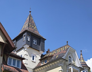
Heidelberg roof, July 2007
4030x3174 pixels, 3 images, single row, handheld:
shot from across the street (maybe 15m away)

has a significant shift applied in the alignment due to the upward angle of view

Tripod: for tripod work I overlap a little less and work with panning horizontally. that doesn't necessarily mean keeping the camera level, which isn't possible for multi-row work anyway. Again, more overlap for closer subjects. I always use a remote release and mirror lock-up. I allow at least 5s after mirror up before firing the shutter to minimise camera vibration. that holds just as well for any tripod work, not just panoramas.

HDR brackets: I've started doing multi-exposure HDR panos. For this I have a programmed release which fires the mirror lock-up then the shutter at 5s intervals for 3 exposures for each camera position. I usually use +/-1 stop brackets with the longest exposure putting the shadows mid-histogram.

Close-up: If there is anything close, lots of overlap. Anything closer than 5m will cause problems, even with great software. I avoid that stuff unless the whole subject is close, then lots of overlap and always with a tripod.

Processing

RAW conversion: the aim of my RAW conversion is to balance colour & exposure and also remove significant distortion (although the latter is really a post-conversion step). My target is a colour values change of less that 10% in the overlap zone in adjacent frames. I typically add a little sharpening to the conversion, too: helps with fine tuning the alignment.
Typically I use CaptureOne for the conversion, especially if there is little distortion or exposure difference between shots. the I will apply equal settings to all the frames. Sometimes i use ACR followed by PTLens in Photoshop to correct distortions. Stitching is easier if basic lens distortion is fixed first, even if your stitcher uses lens distortion data.
If I've done HDR, I'll do the combination and tone mapping (with identical settings for each frame) using Photomatix Pro from the 16-bit TIFFs.

Alignment: my stitching is all done with PTGui from 16-bit TIFFs. I don't think any other program comes close in power to this. I tweak the alignment, stitch type (rectangular, cylindrical etc), angle of view, shift etc. Sometimes I have to run the optimiser carefully going through a sequence of steps to close down max error below 10 pixels. I won't go into all the details as it is a very powerful program. 90% of panoramas need nothing more than the auto settings, however.

Blending: always with the Smartblend plug-in. Nothing else comes close. It fixes colour/lum shifts, parallax & various artifacts between images (it has even removed extraneous people from some). I have not yet, with decent original alignment, seem any sign of the stitch points using Smartblend, and that's at the pixel level.

Output: always to max size, 16-bit TIFF.

Final adjustment: Once it's stitched, its off to the regular processing software for final adjustments (crop, contrast, curves, B&W, sharpening etc etc). I'll also do a resize for the output print size which is usually a shrink.

Overall it takes about 10-20 minutes to get to the stage of producing the output. A few minutes for PTGui to work the output magic, then final adjustments. Not a long process at all.
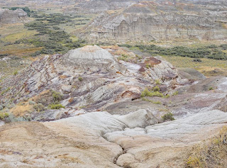
Dinosaur valley, Alberta, August 2007
3887x2882 pixels, 4 frames, 2 rows, HDR: total 12 shots, tripod mounted
looking down so again a significant shift applied in alignment
this produces a very finely detailed 24" print (scaled-up)

Outcomes, conclusions

Pixel level examination: with this total workflow (capture to output) I'm getting prints that can be examined in fine detail, close-up with no signs that a stitch has been done, whether handheld or tripod mounted and without the nodal device.

Simplify the process: overall, Ive worked to streamline this workflow and minimise the kit I need to carry. The output is very good if I take a little care with the initial shooting.